Rethinking the treatment experience for yeast infections with dignity and discretion at the forefront of design.
Completed as a part of a case study to address the lack of empathy and innovation within current over the counter yeast infection treatment kits, Candid is the solution to comprehensive and supportive care for people with vulvas.
From research to final visualization and production,
Candid was created to make yeast infection treatment
feel like a form of self-care.
Candid
disciplines
Design Research
Brand Strategy
Print + Packaging
Industrial Design
tools
Photoshop
Adobe Illustrator
Some context for the project space.
Problem Space:
XX
Key Background Information:
Yeast is a type of fungus that lives in our bodies in small amounts. This is typically balanced out by good bacteria. Infections occur when the balance is disrupted and the yeast grows rapidly.
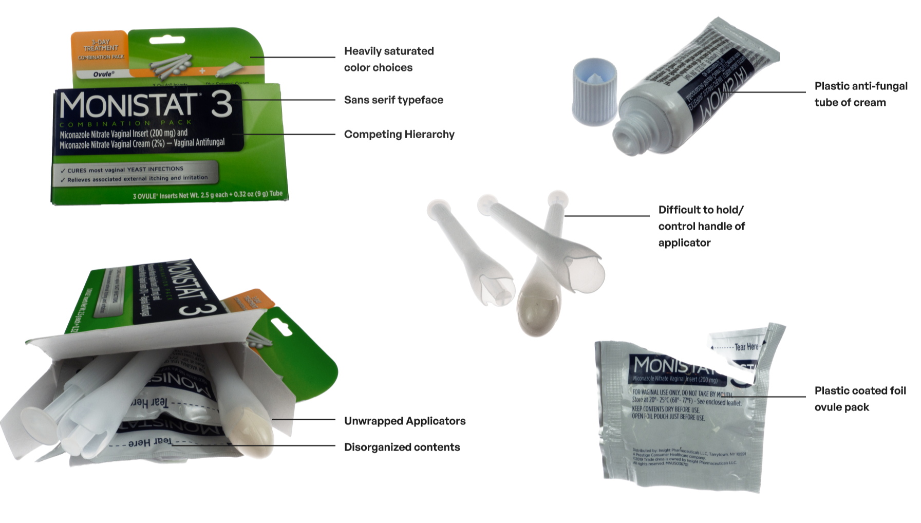
Today, the offerings for current over the counter treatments lack discretion, organization, and sanitization.
Packaging lacks discretion and compromises the privacy of shoppers.
The suppository applicator is difficult to hold and maneuver.
The applicator is unwrapped compromising the product sanitation.
The components of the packaging are not organized in a way that indicates the order of treatment steps, making treatment preparations difficult.
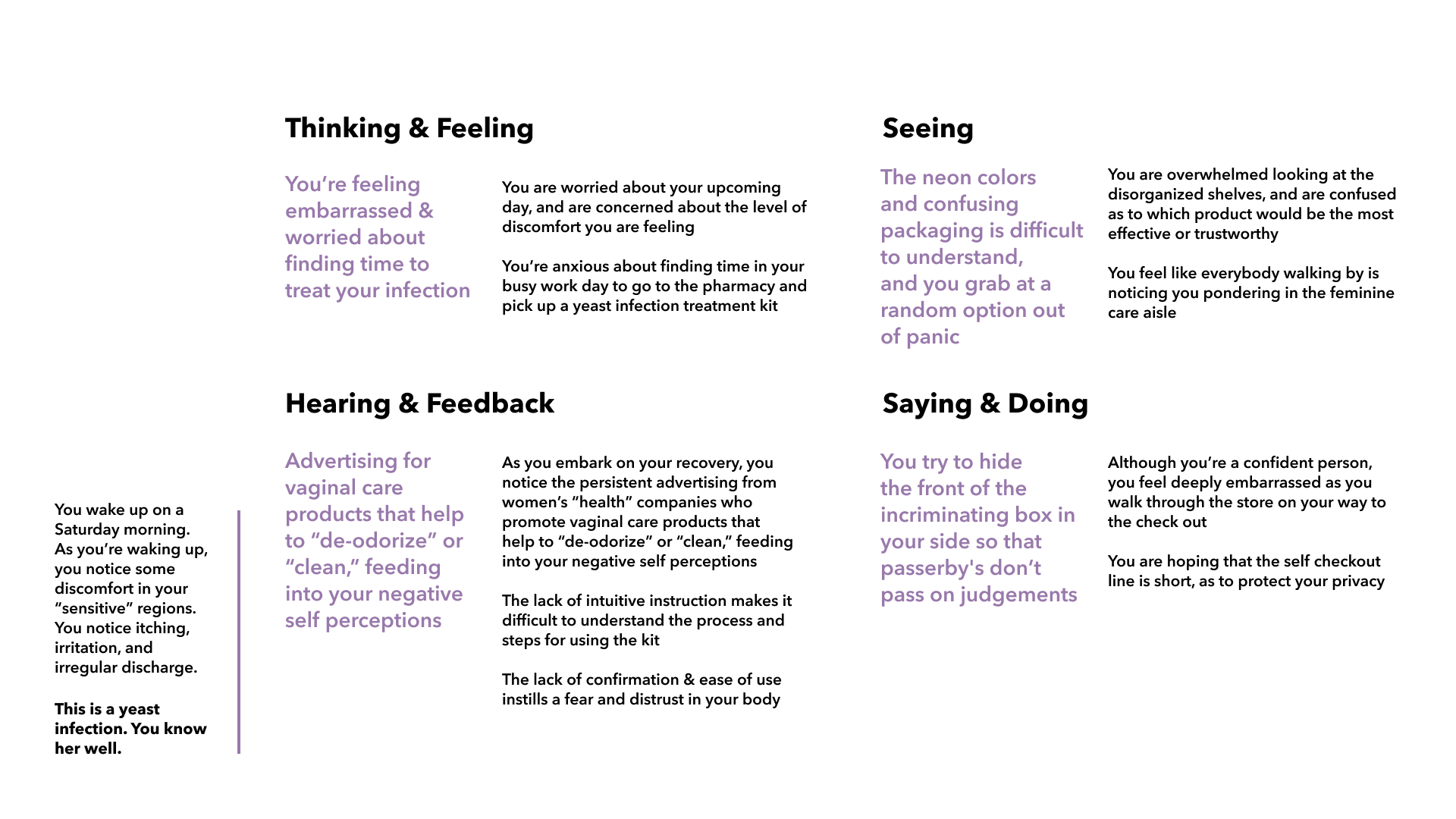
The User Journey
To maintain a human-centered lens throughout the design process, empathy mapping captures in-the-moment nuances users are experiencing throughout the user journey.
this is embarrassing
these all look the same…
what if someone sees my basket?
I hope there’s self checkout.
do I need to cleanse, treat, or detox?
Because anyone with a vulva can experience a yeast infection, it is important to identify the range of users who may be on the market for treatment.

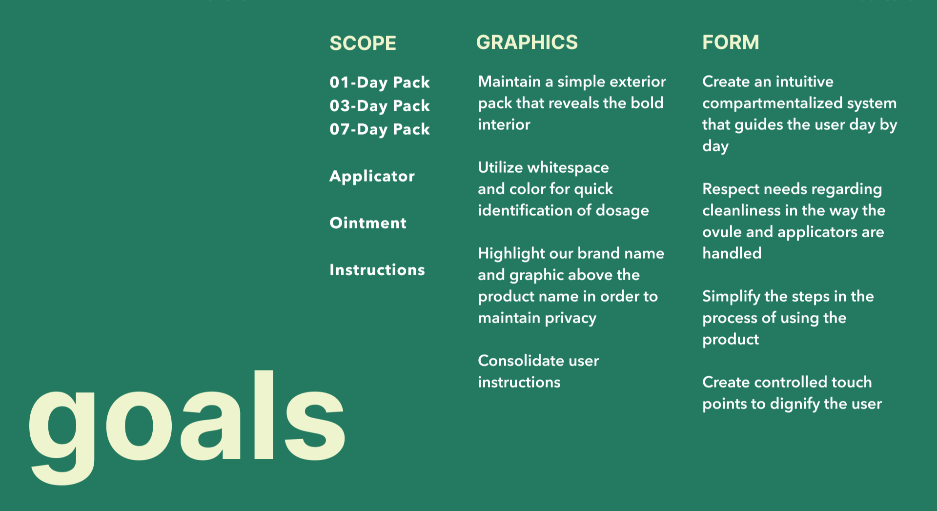
Opportunities & Design Scope
To elevate the treatment experience and honor the comfort level and dignity of users, there are 4 key opportunity spaces which would enhance the shopping experience, improve treatment usability, and increase the sterility of the product itself.
External Package
Internal Instructions
How might the external pack graphics enhance feelings of comfort and empathy?
Organization of Contents
How might the internal contents be arranged to compliment the order of use?
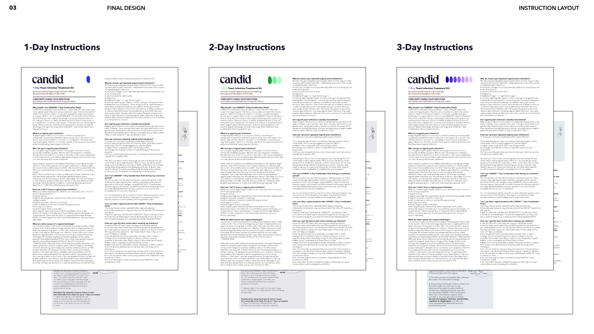
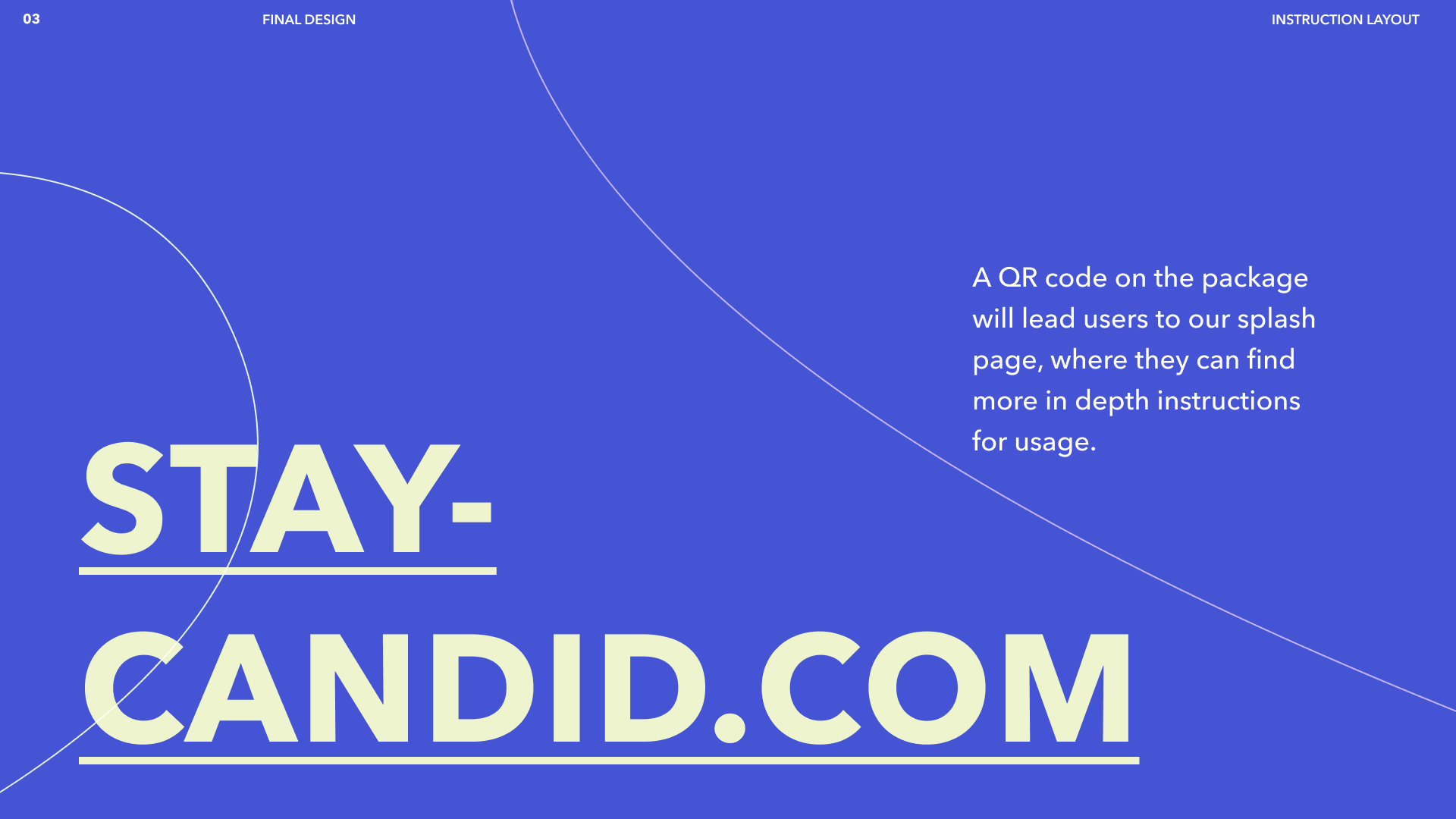
How could the instructions for use be more human centered and accessible?
Sterility of Treatment
How might the organization or form of the pack enhance product sterility?
Brand Positioning
Defining Candid’s brand positioning meant first creating a clear mission and vision statement, along with values that would drive not only the visual direction of the brand, but also Candid’s product design.
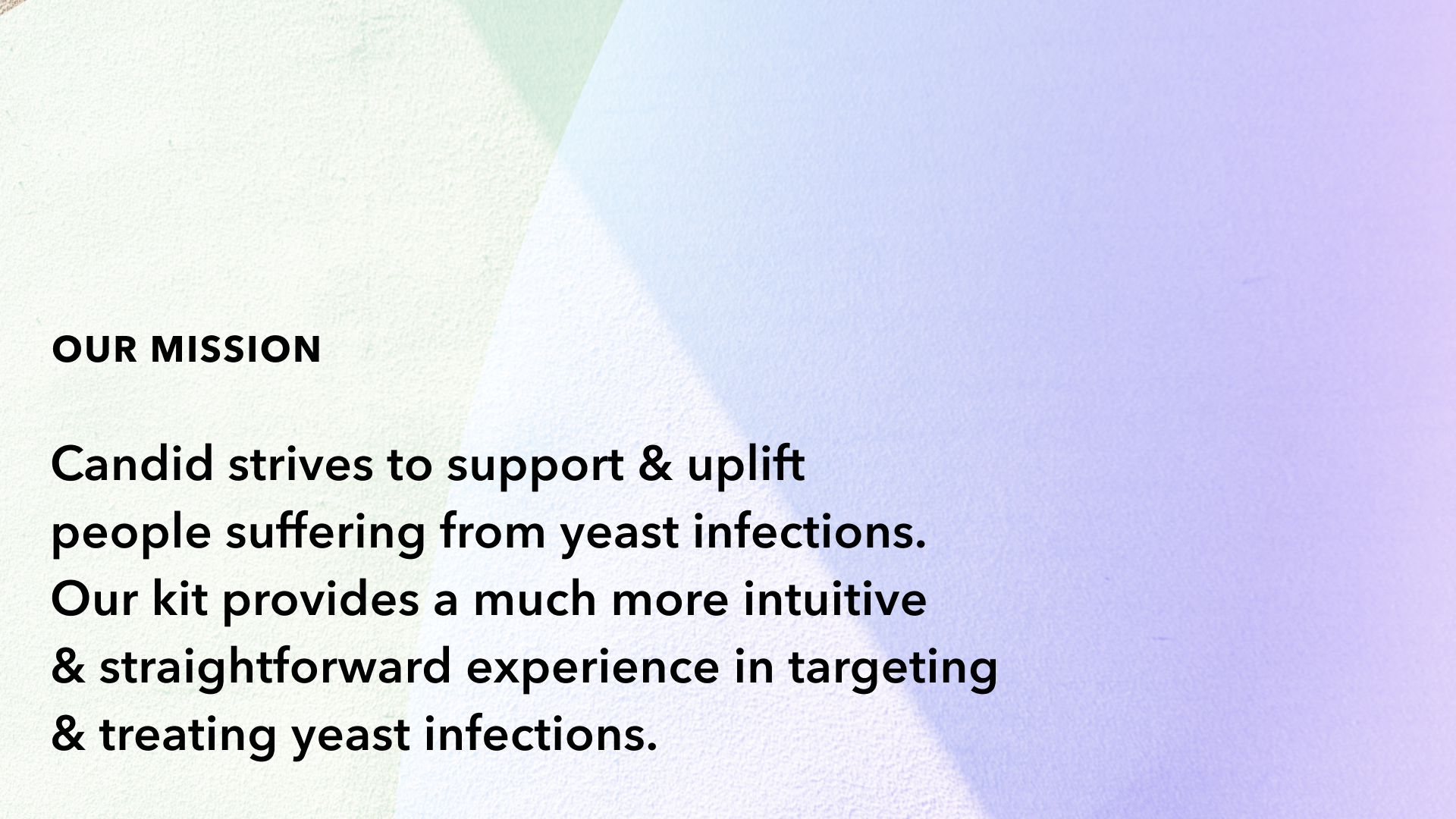
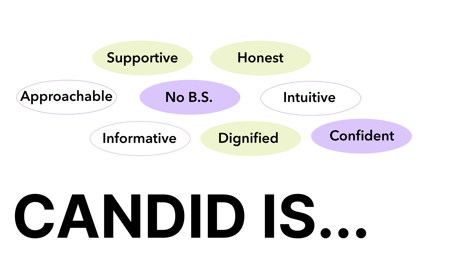
Candid focused on the following values as guiding principles throughout the design process to ensure effectiveness and quality

Graphic Direction
In creating Candid’s tagline, our team wanted to ensure that the tone of Candid’s brand balanced between both dignifying and comforting, while still bold an unapologetic
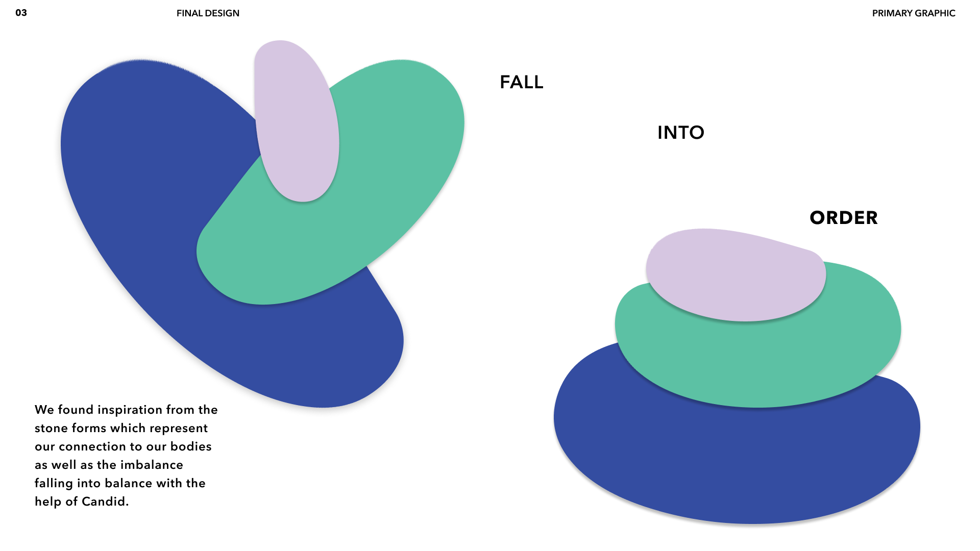
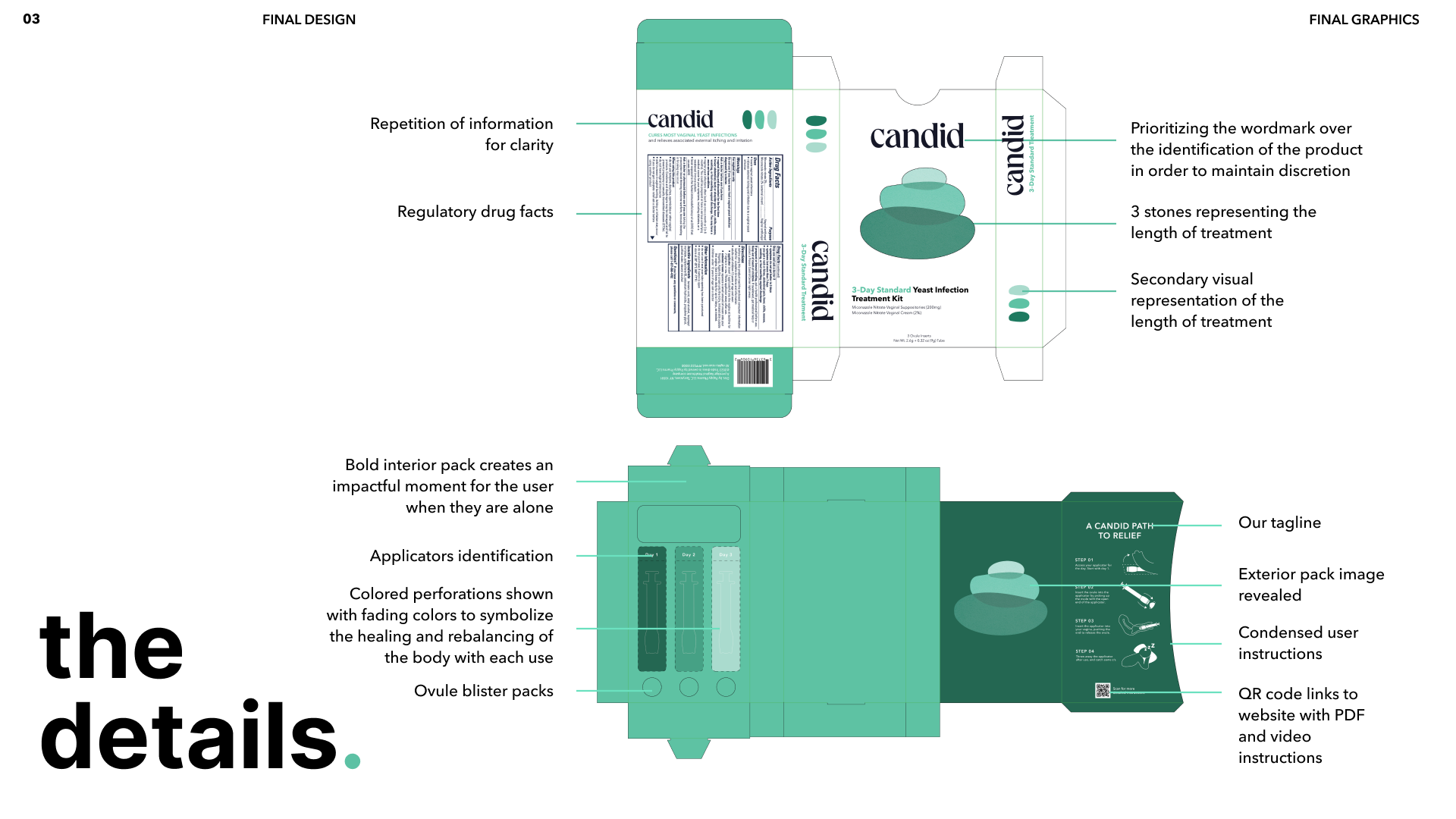
Candid’s primary graphic element are the stones, which represent balance and connection within and to our bodies. We liked the idea of the stones being a natural element, but also somewhat representative of the healing ovule within every treatment.
The Candid wordmark is a direct reflection of the goal of balancing between dignified and approachable. A sophisticated typeface feels strong and elevated, while the rhythmic beats within the counters of the letterforms create moments of contrast and play.
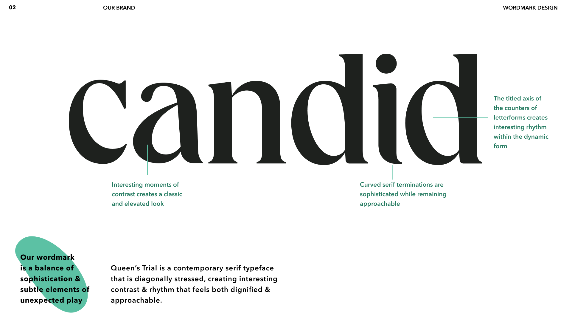
Wordmark
Candid shows elements of playful connection, unexpected color, and texture.
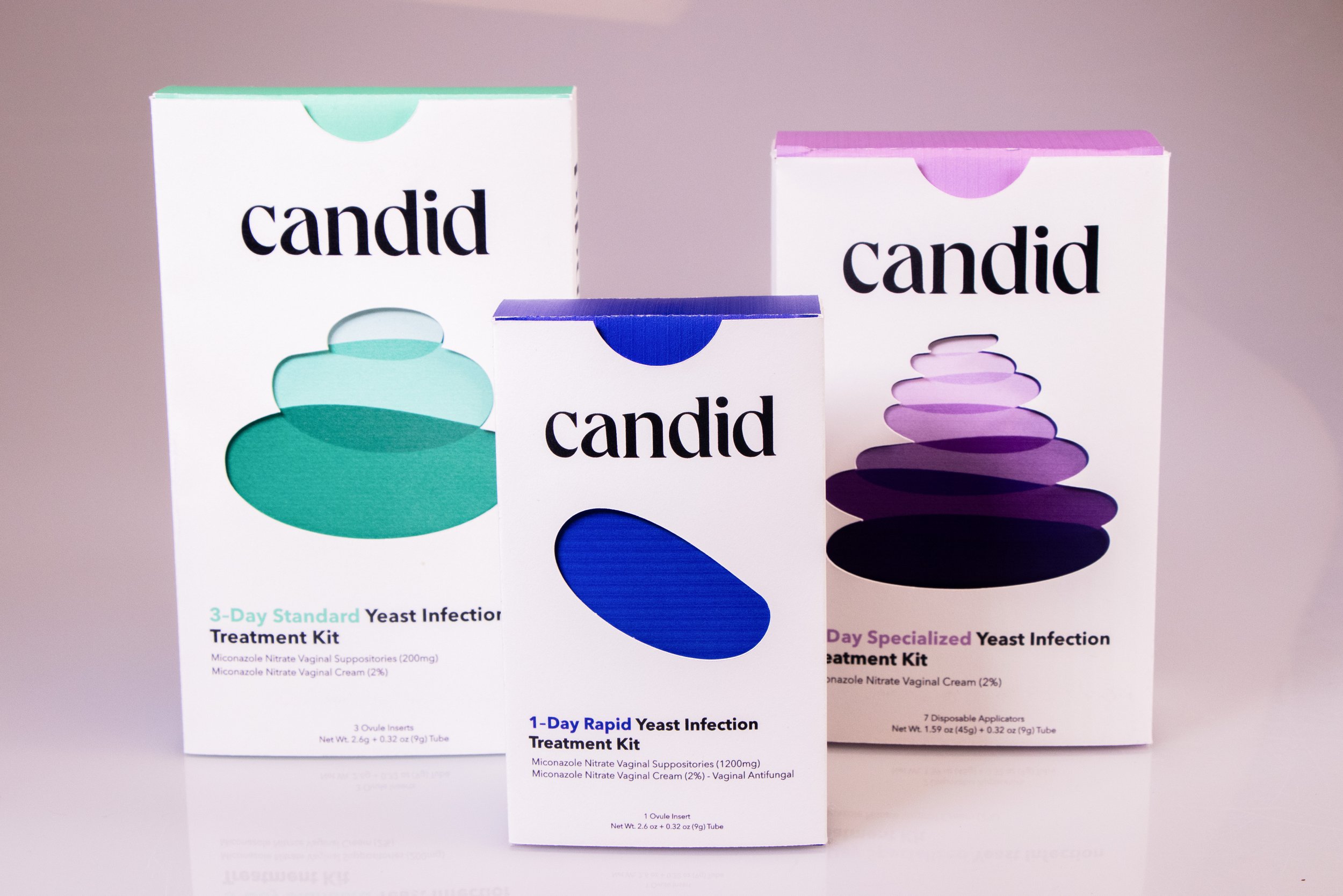
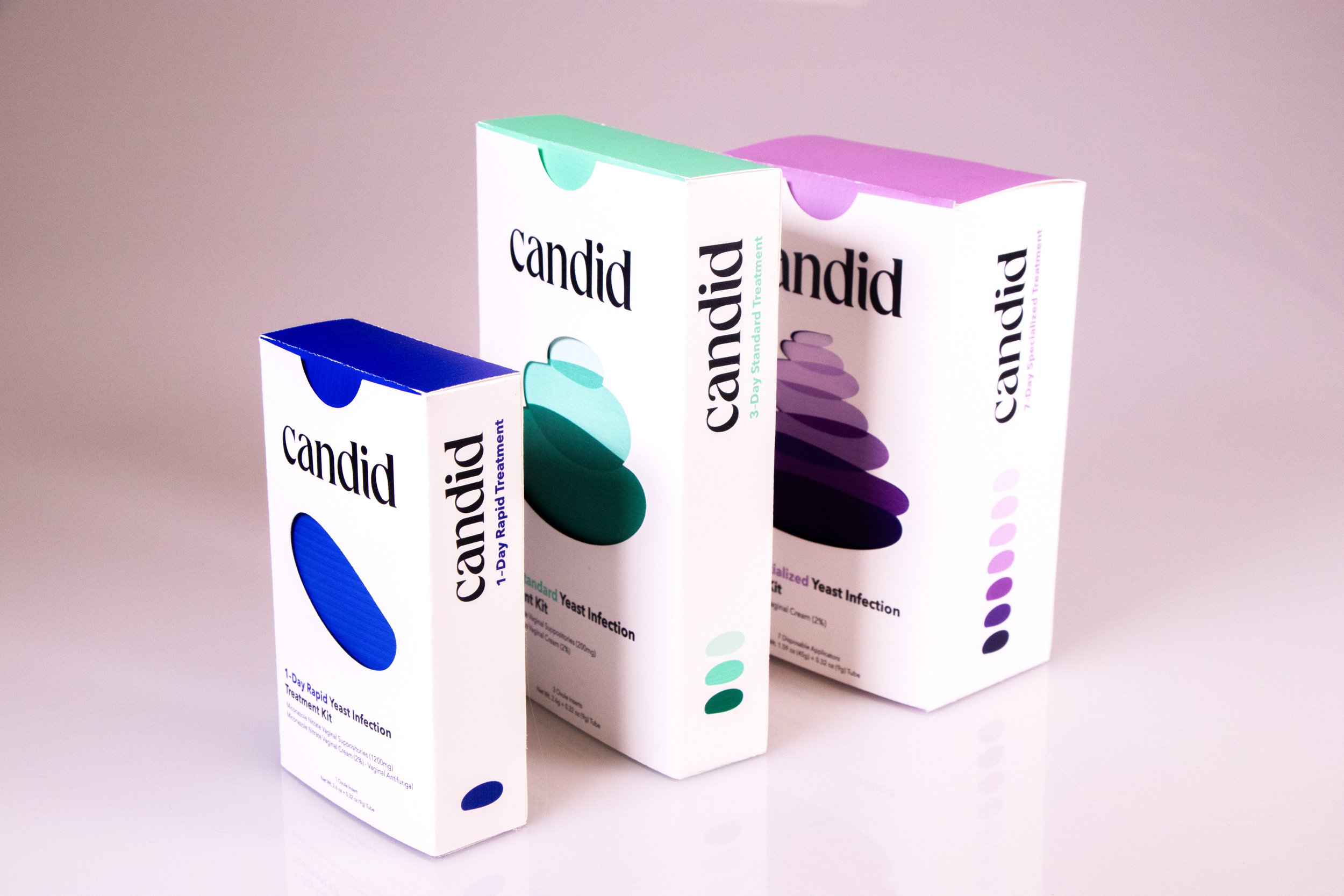
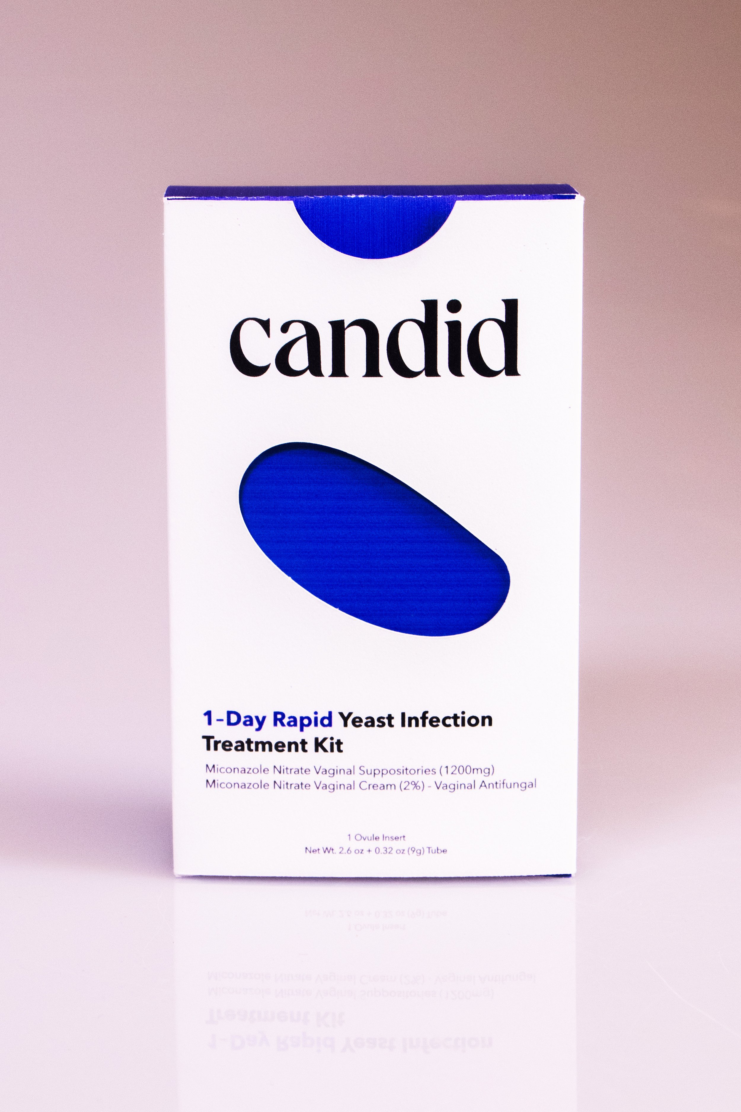
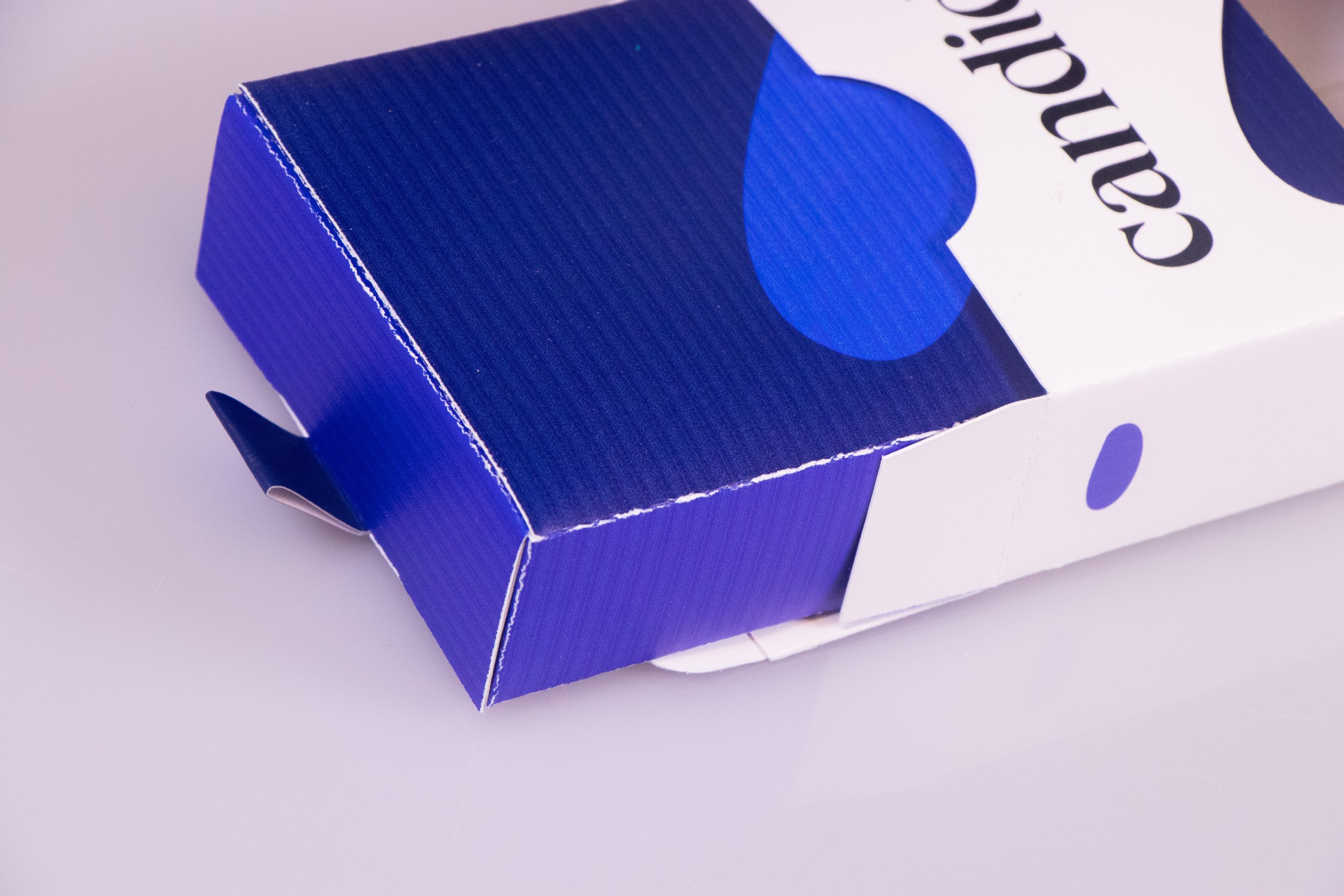
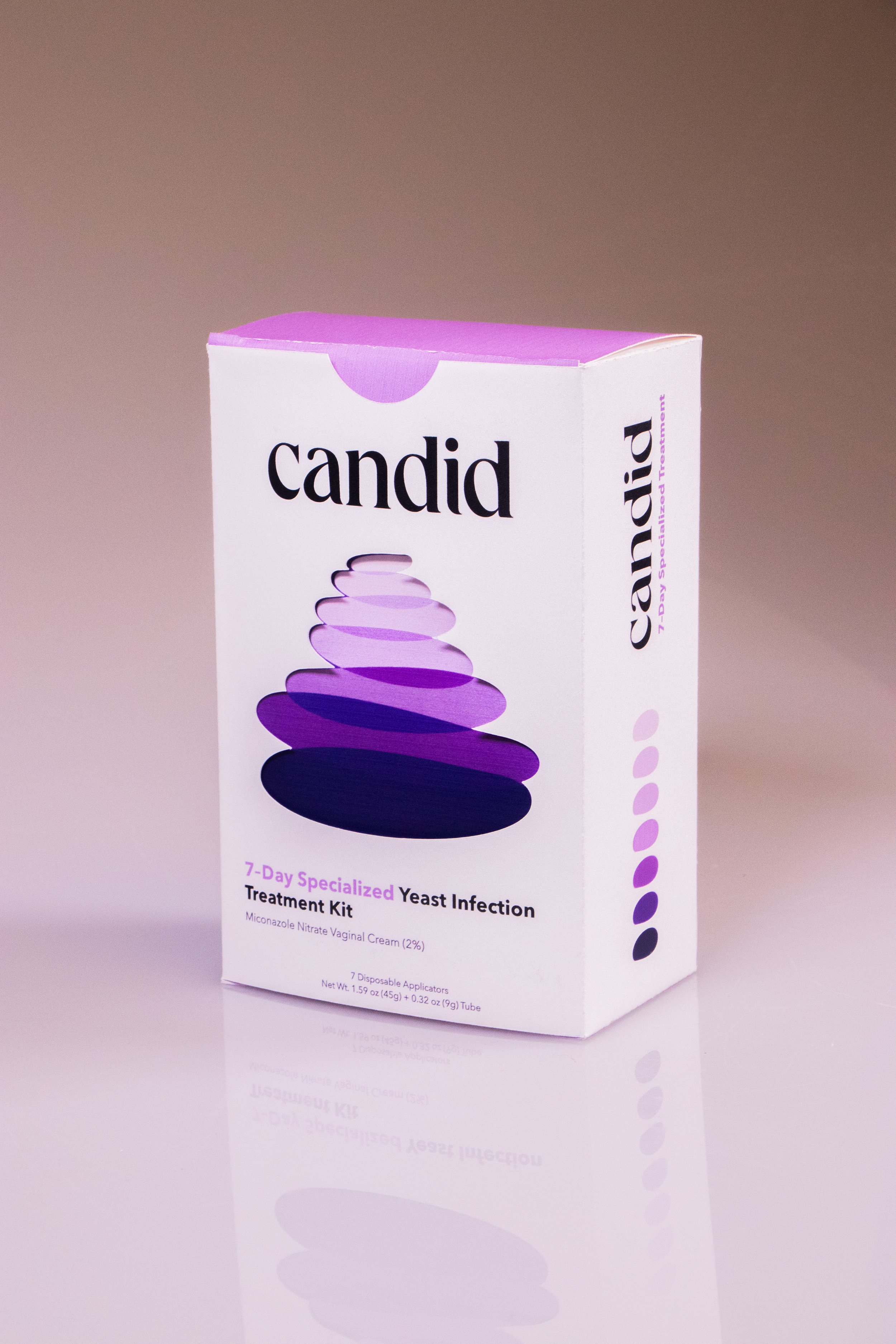
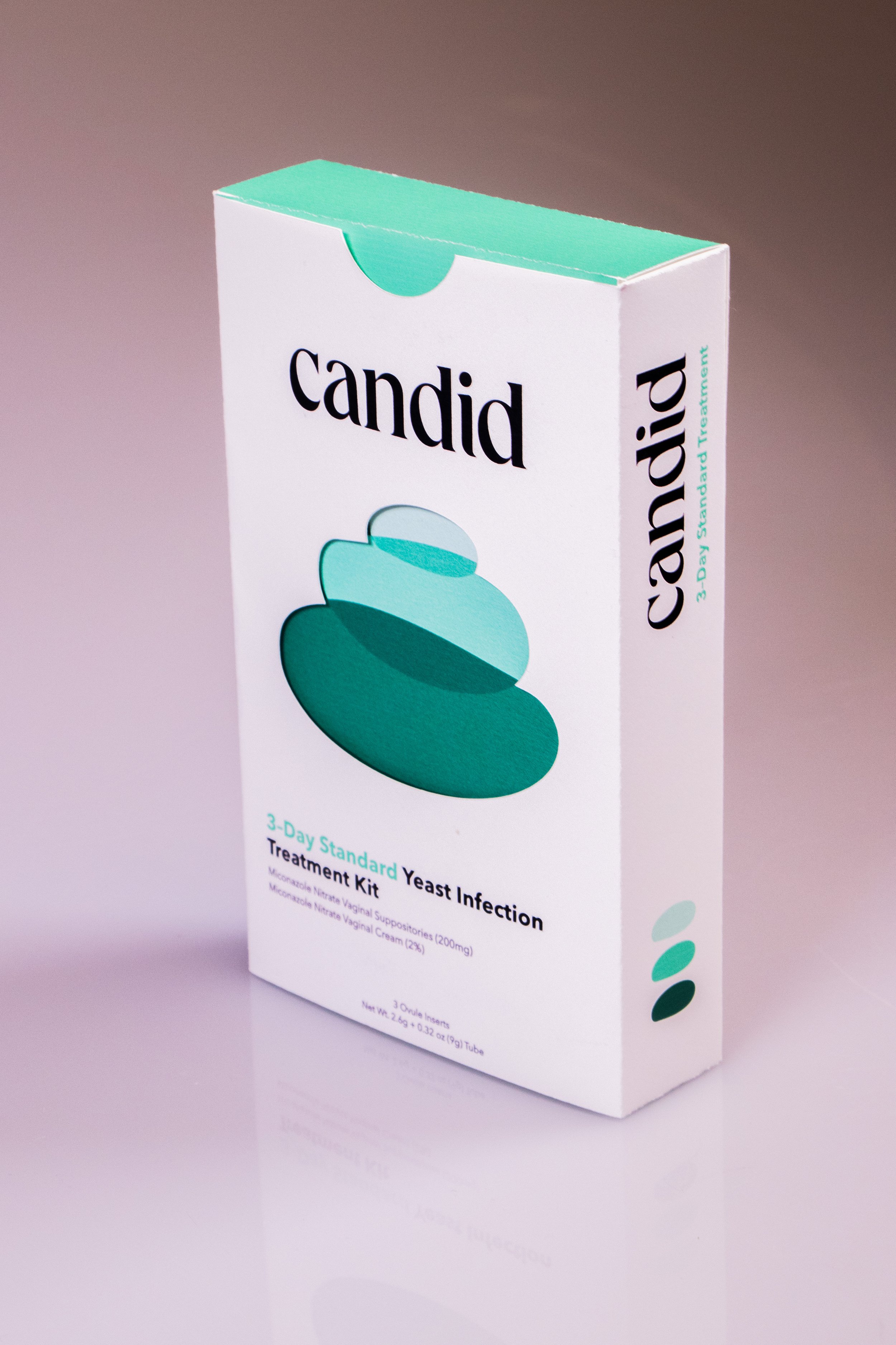
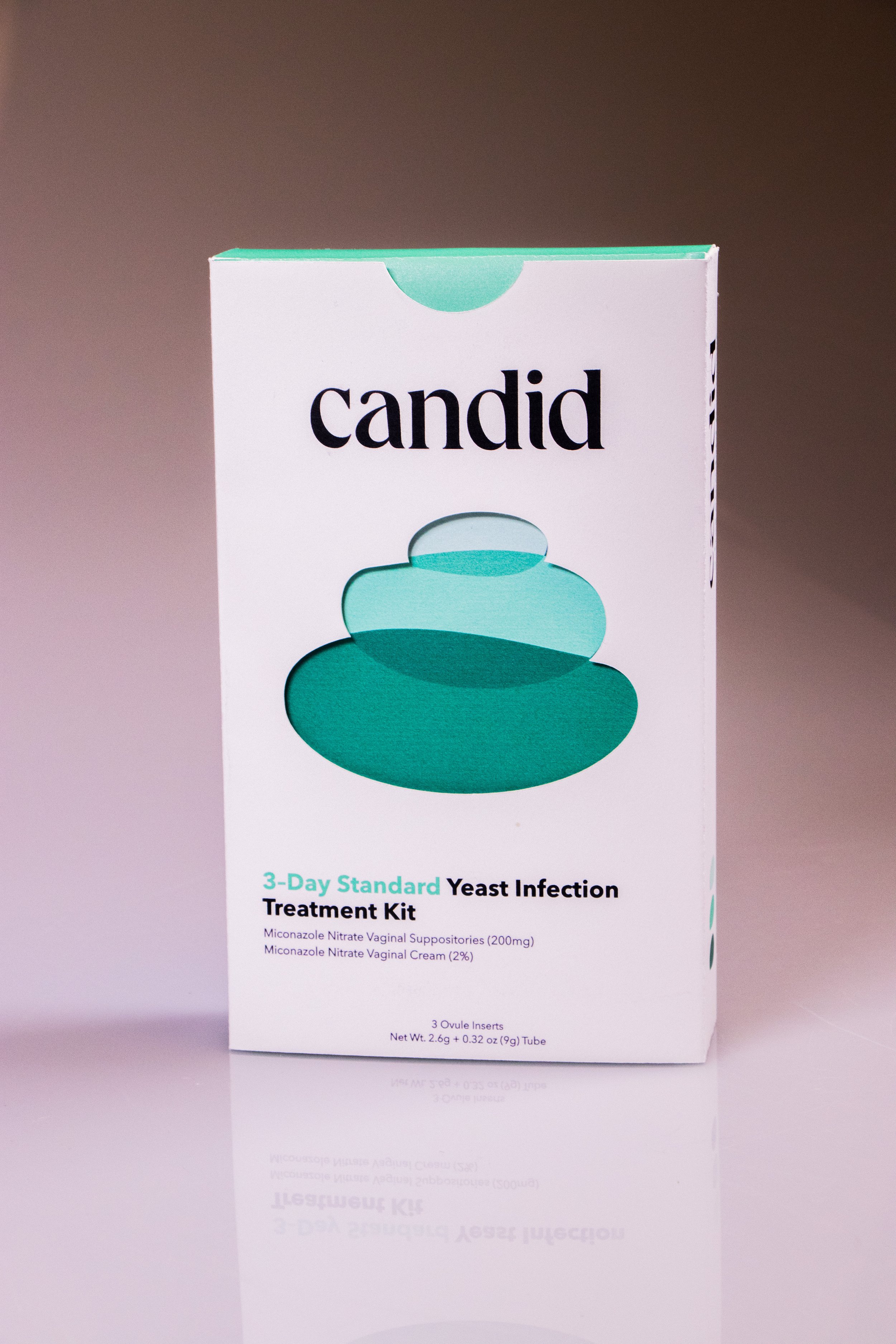
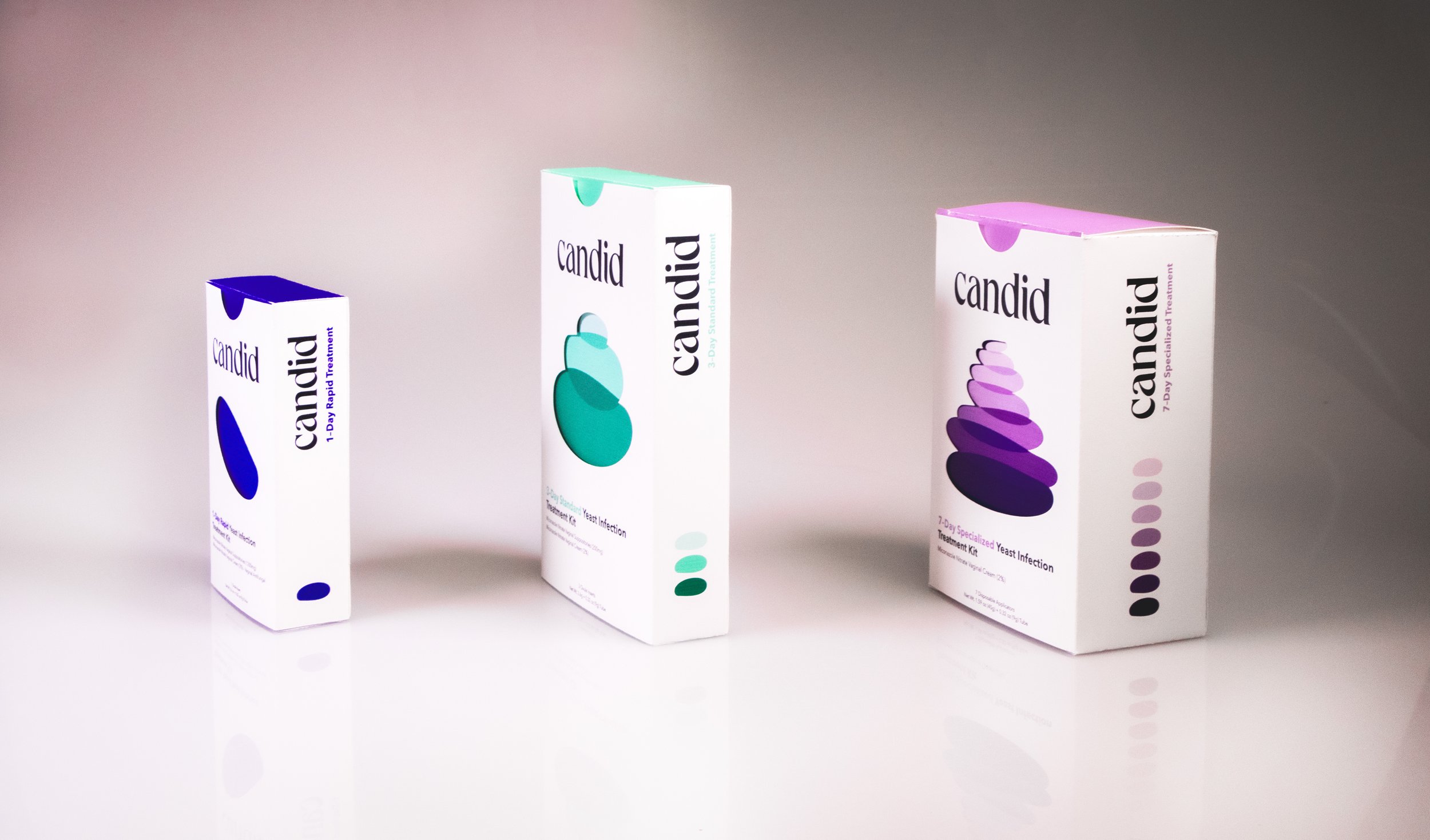
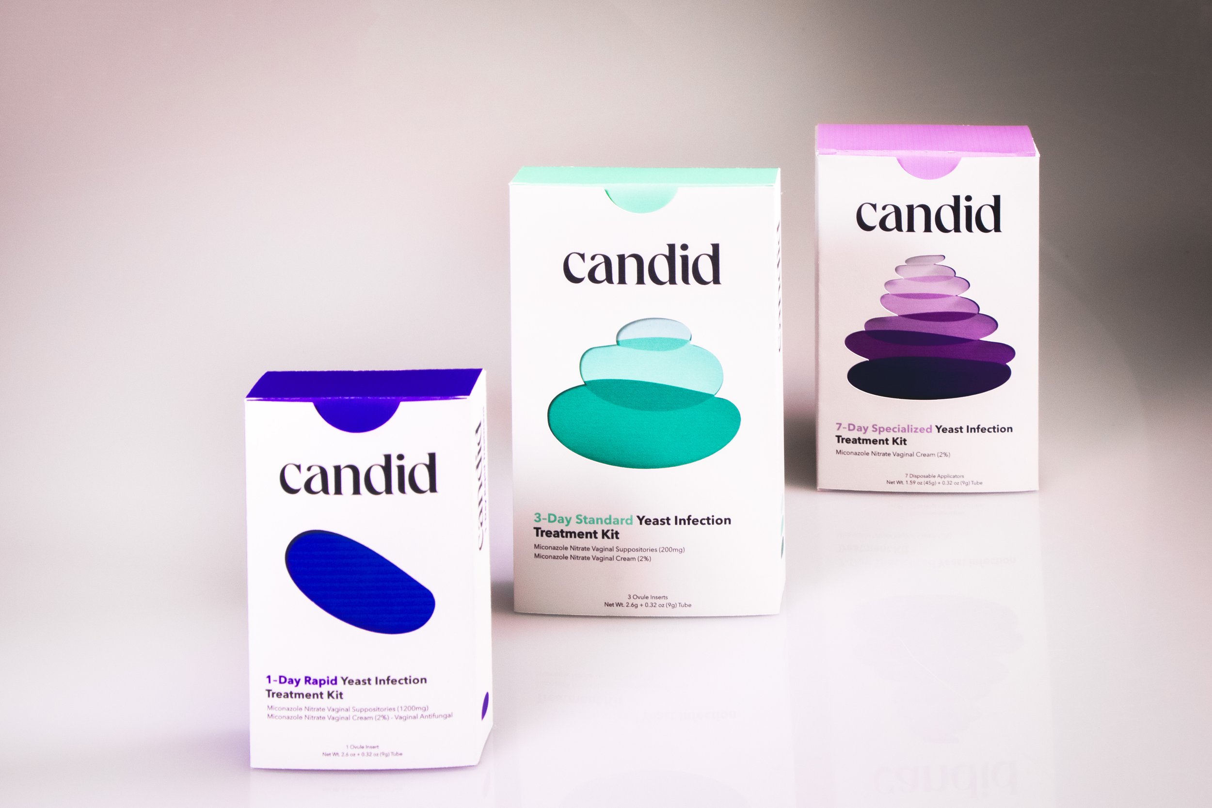
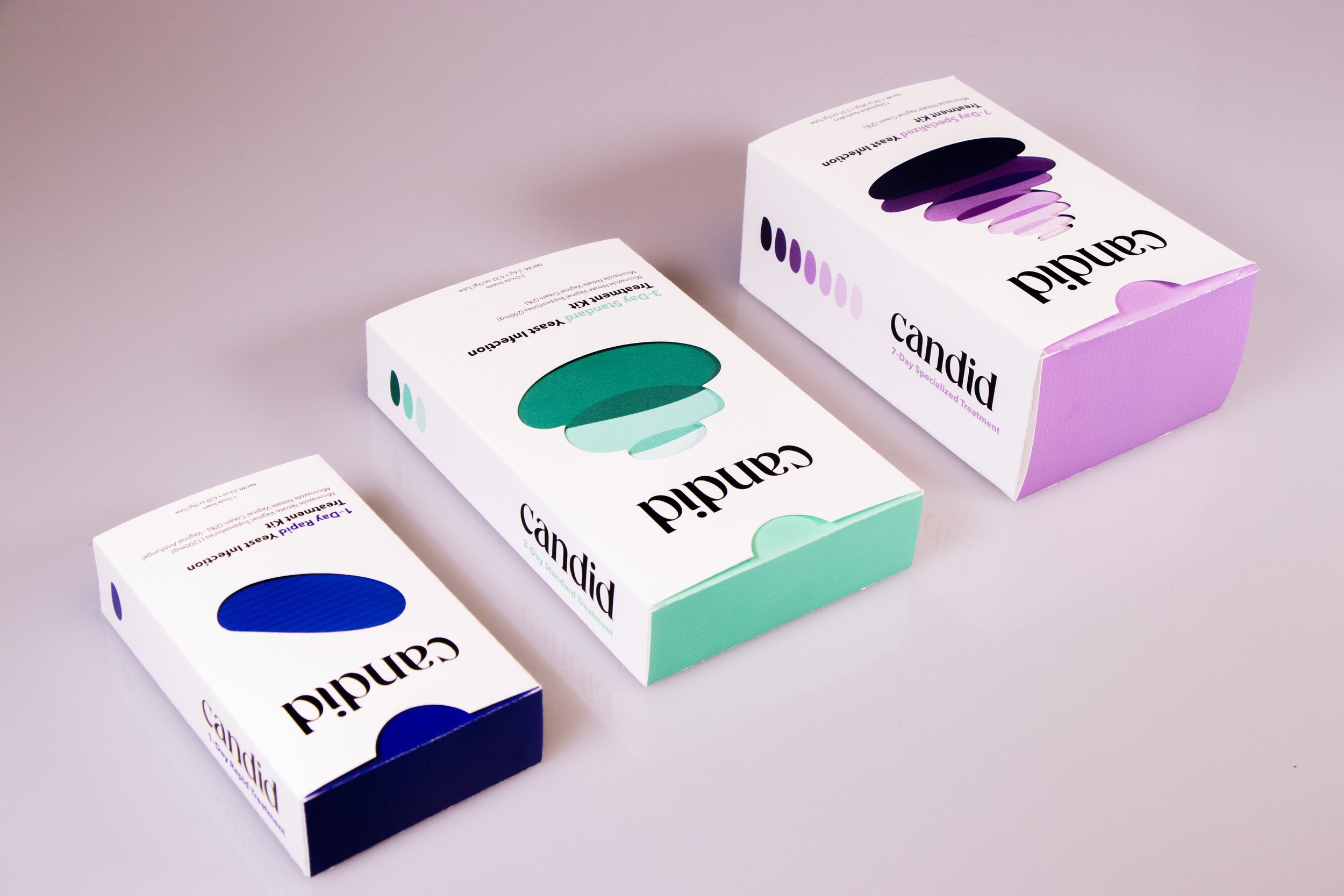
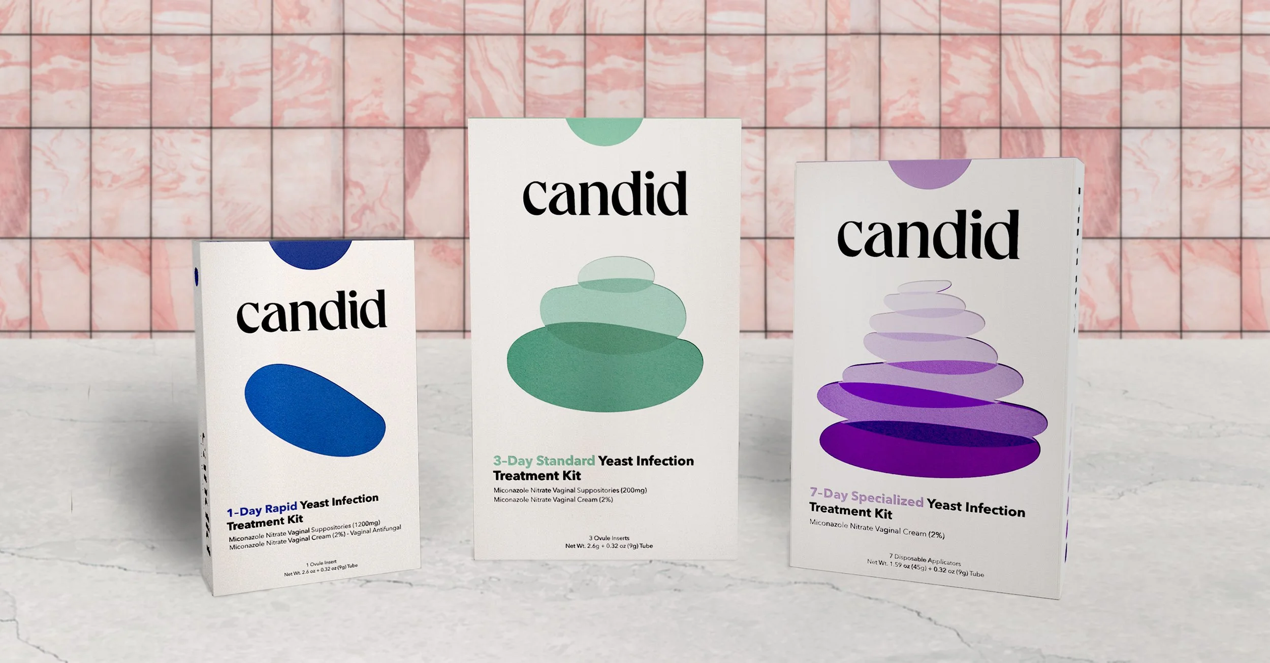
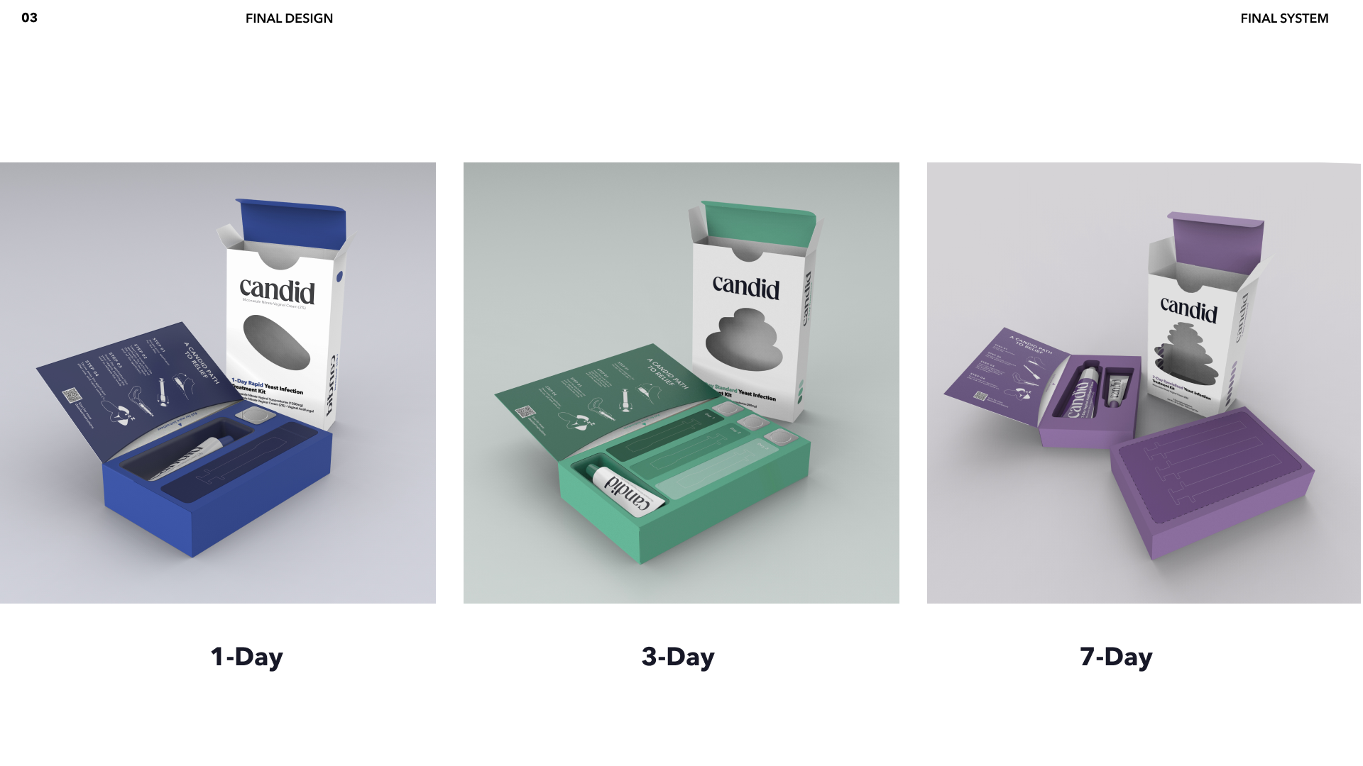
The final color palette for Candid utilizes the existing color convention that other treatment kits use. Where blue is the 1-Day treatment, green is the 3-Day treatment, and purple is the 7-day treatment
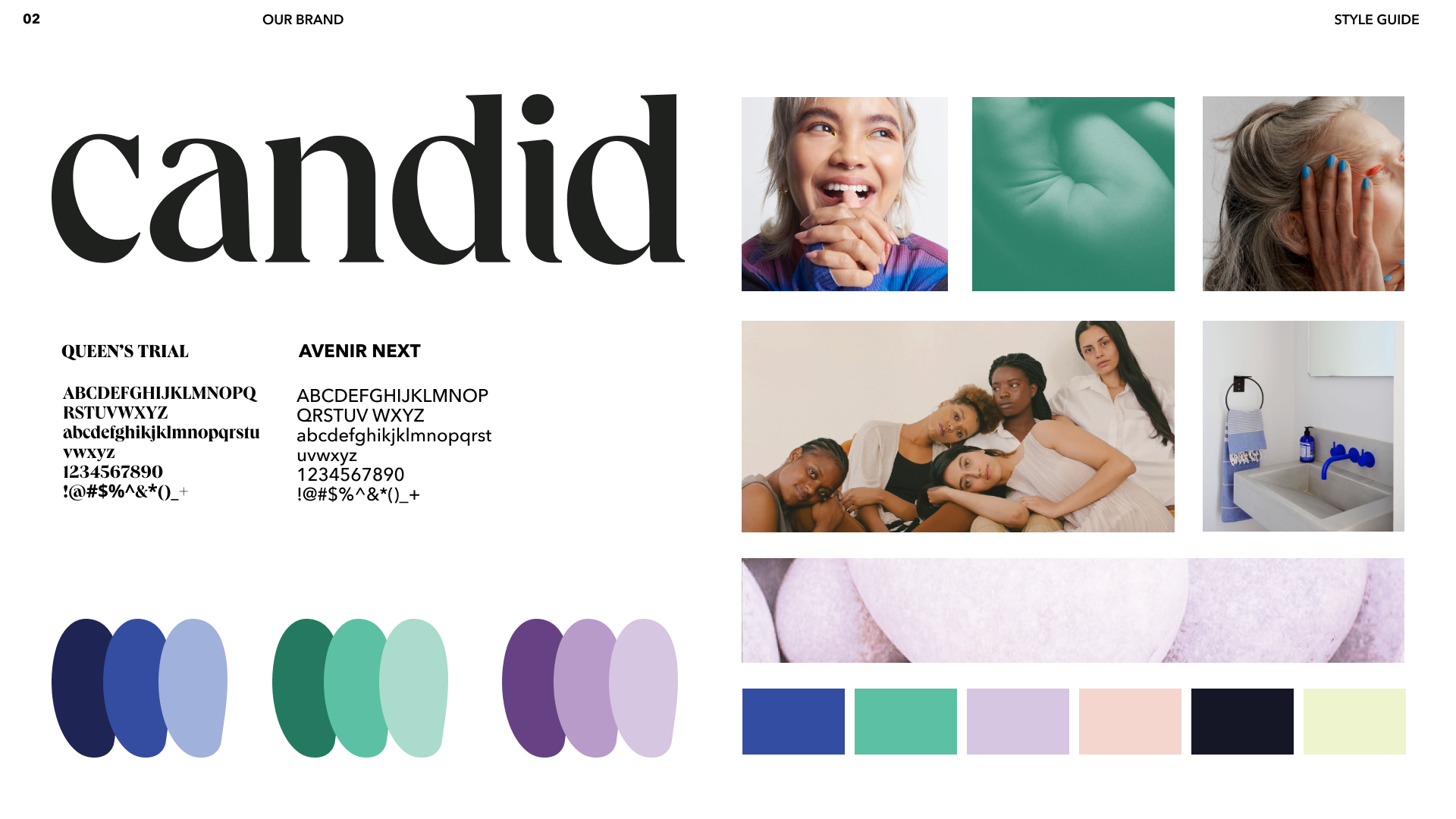
Style Guide
Once the brand and graphics direction for Candid became clear and refined, it was then time to apply the same graphic principles to the physical package and product.
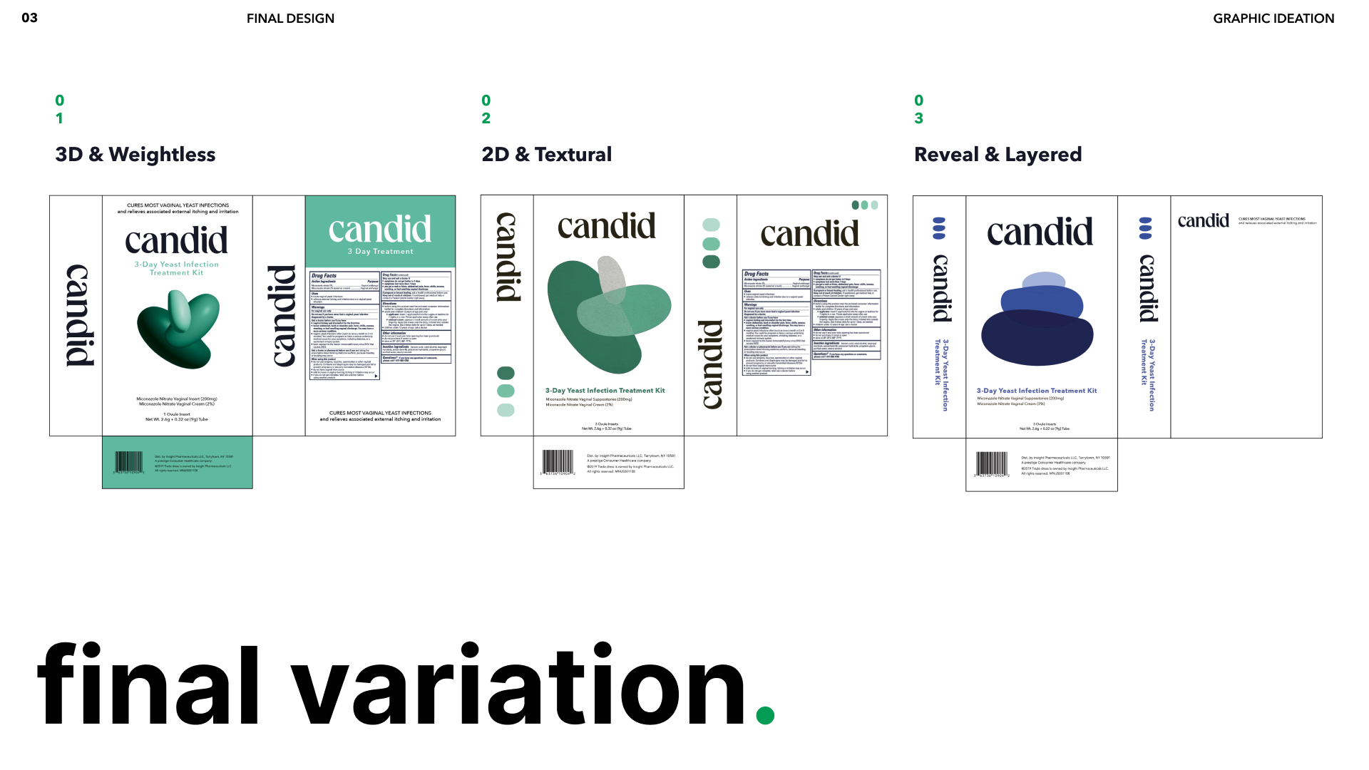
4 clear directions for packaging were defined. Based on user testing and
evaluation of potential materials for each, elements from concept 1 and
concept 3 were combined.
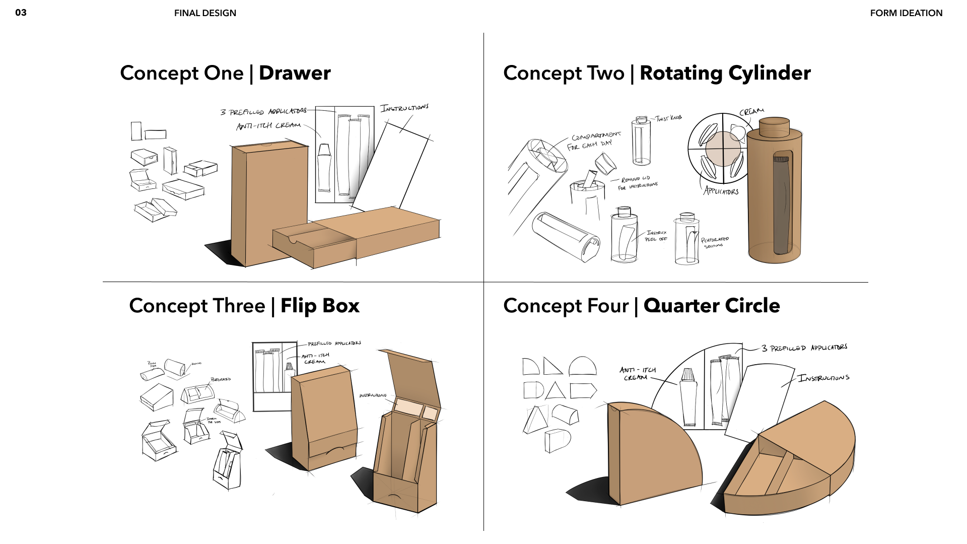
Form ideation
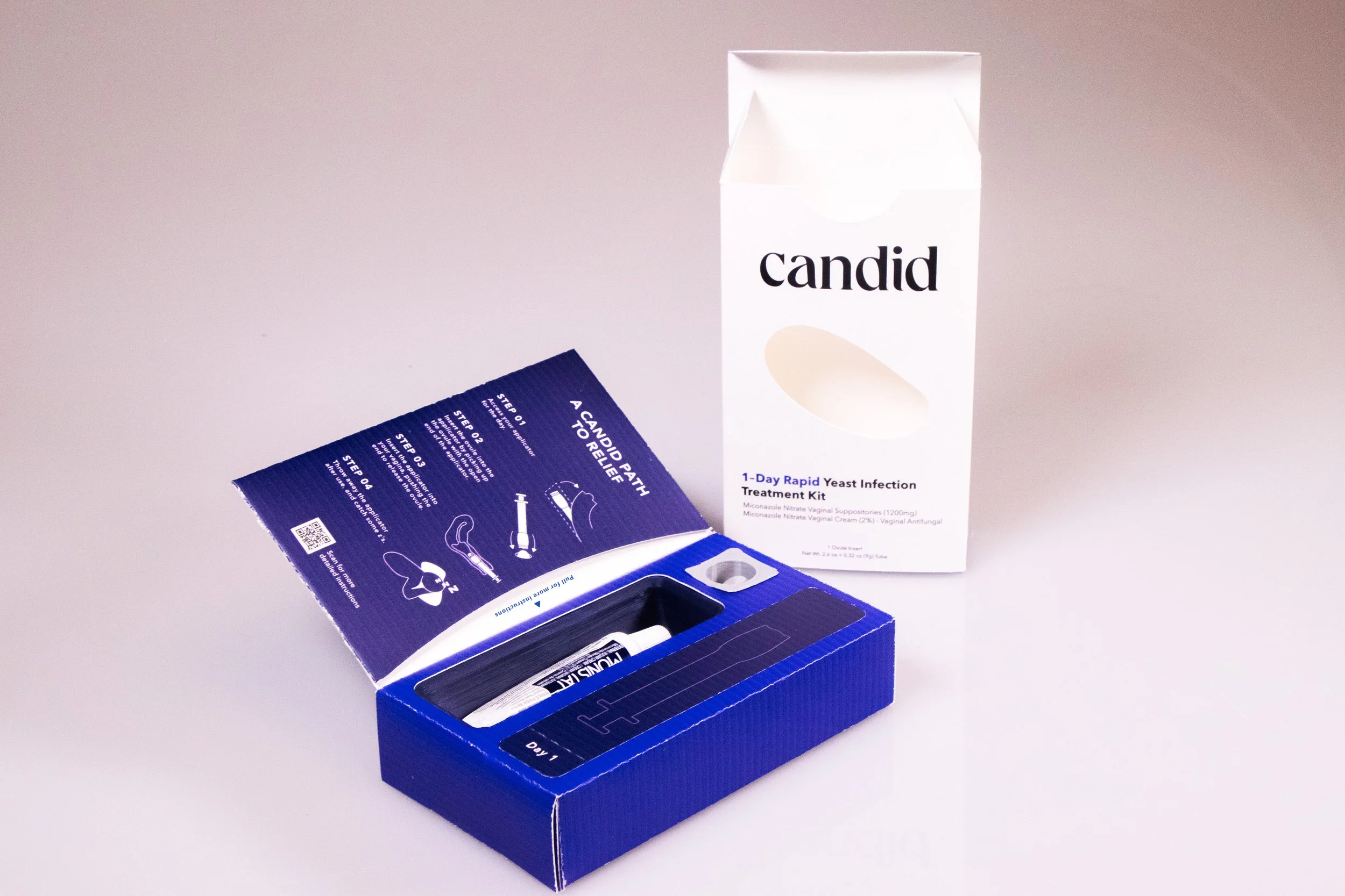
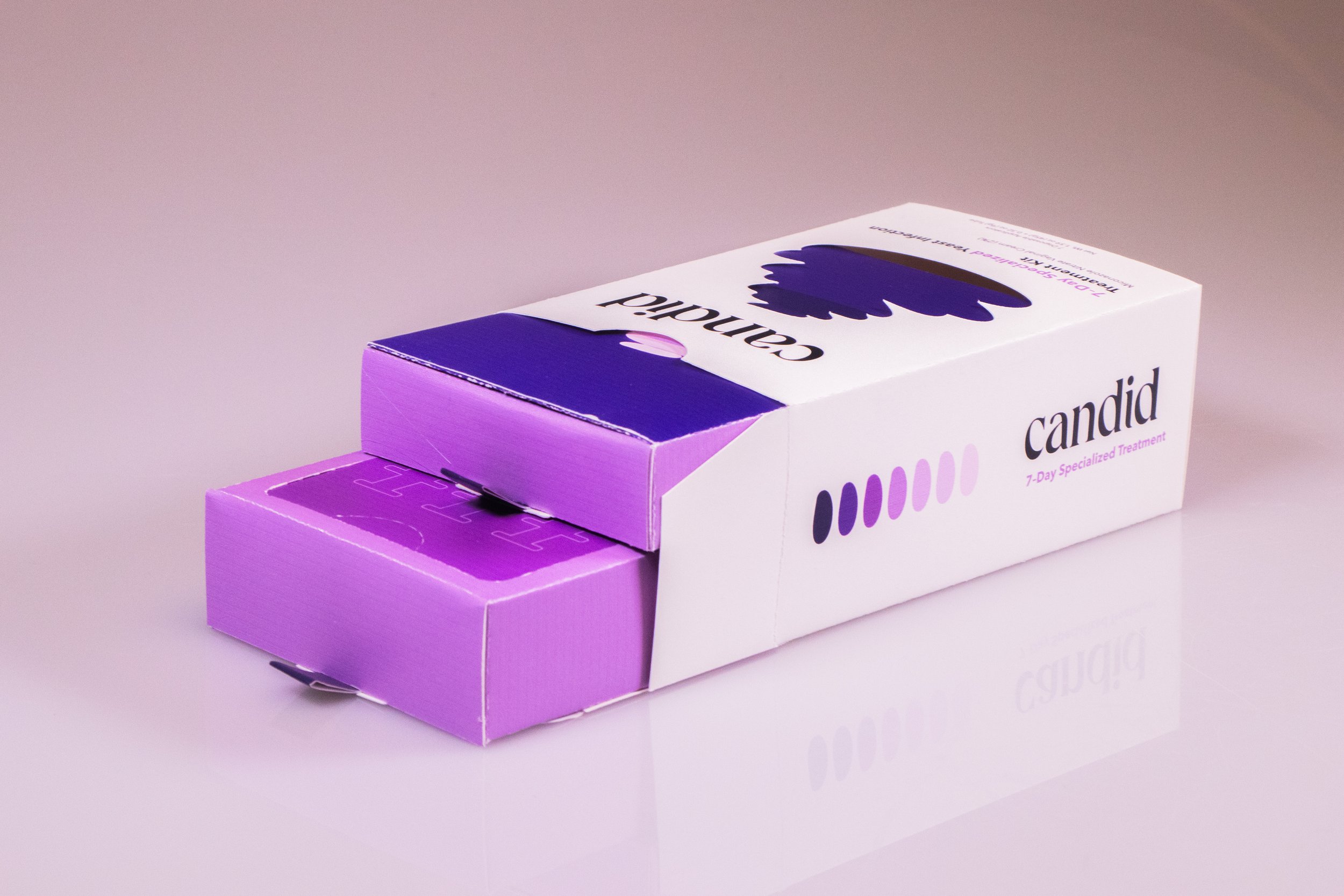
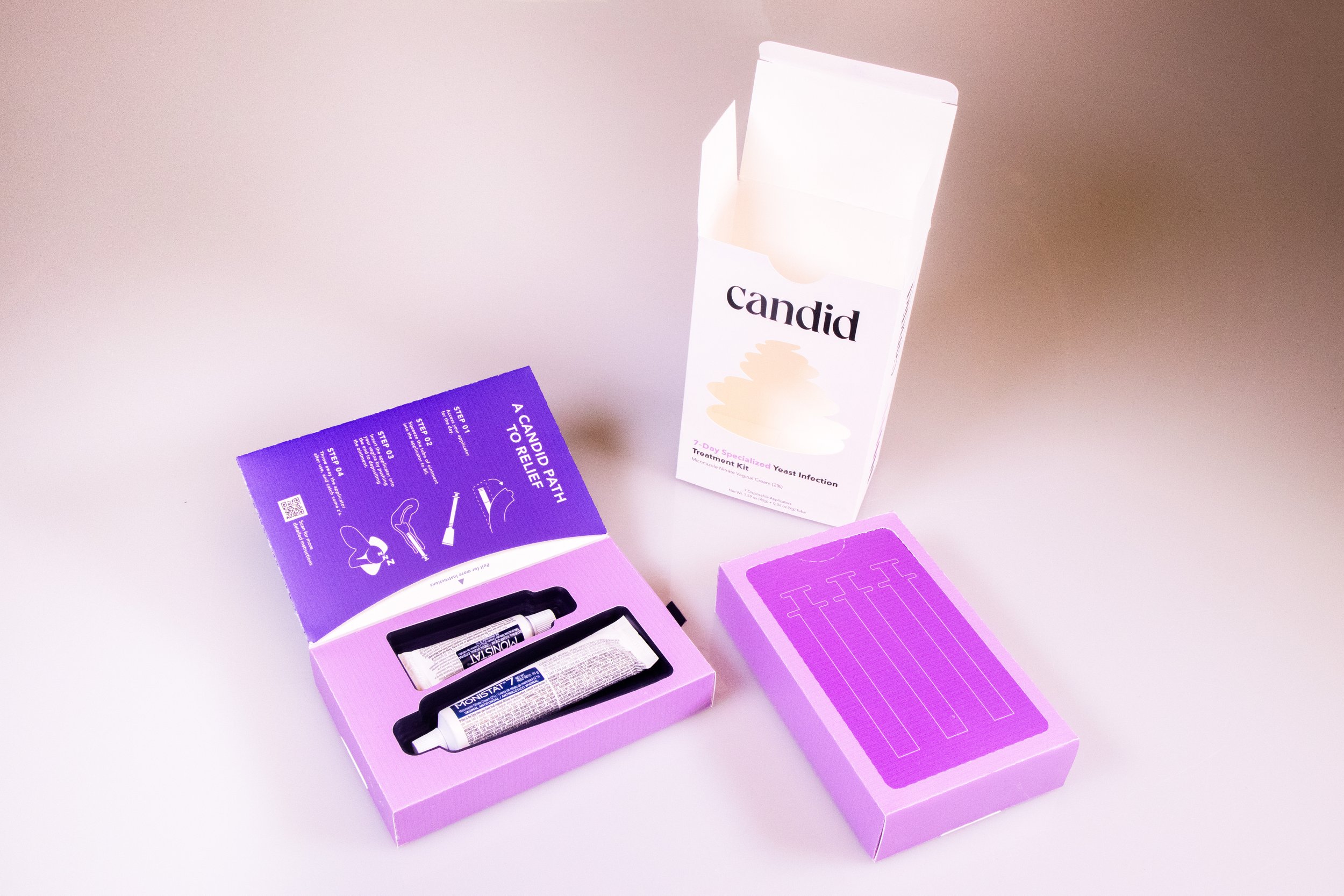
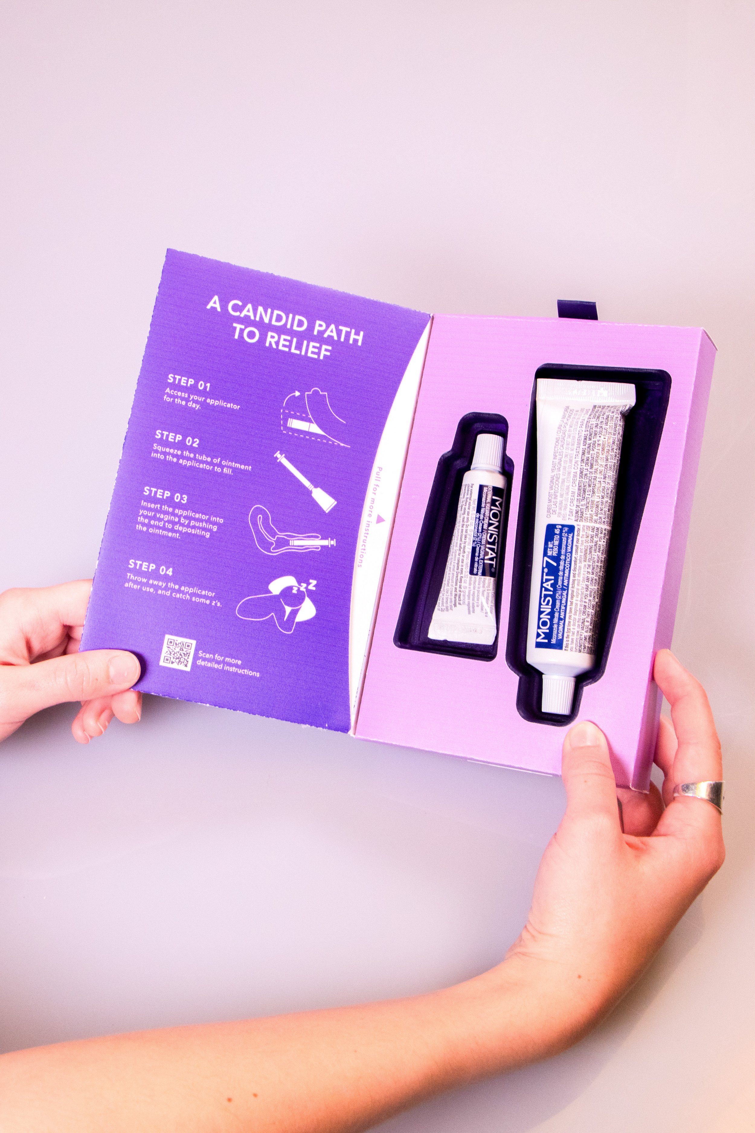
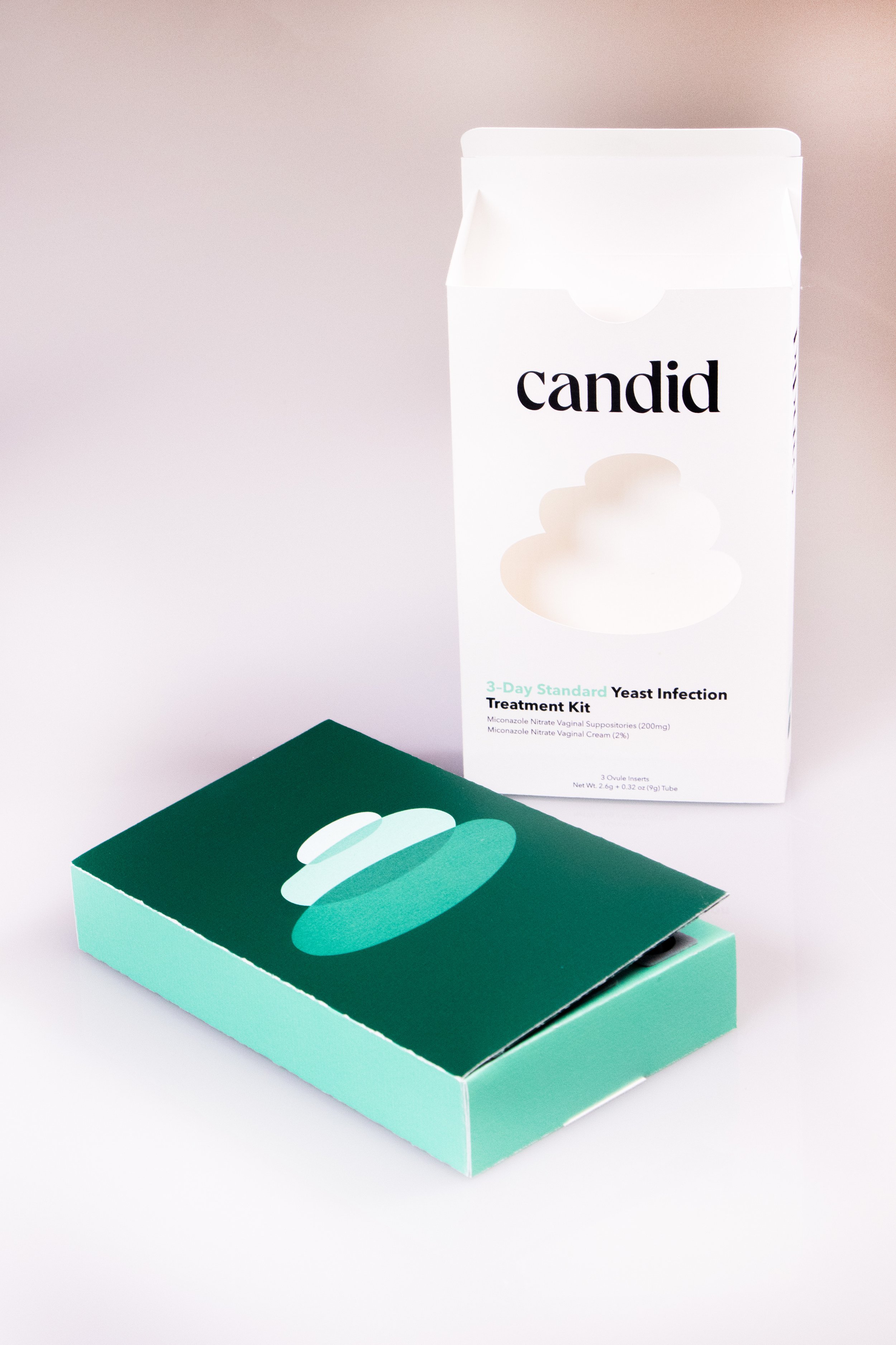
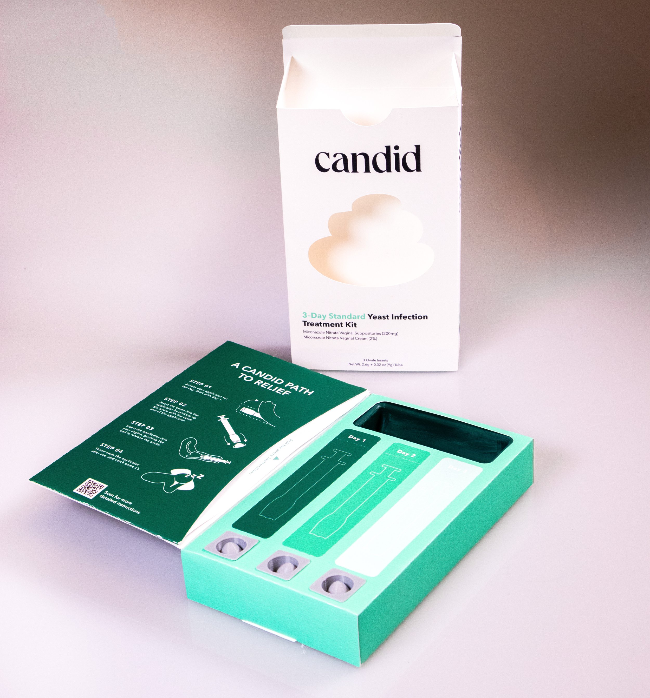
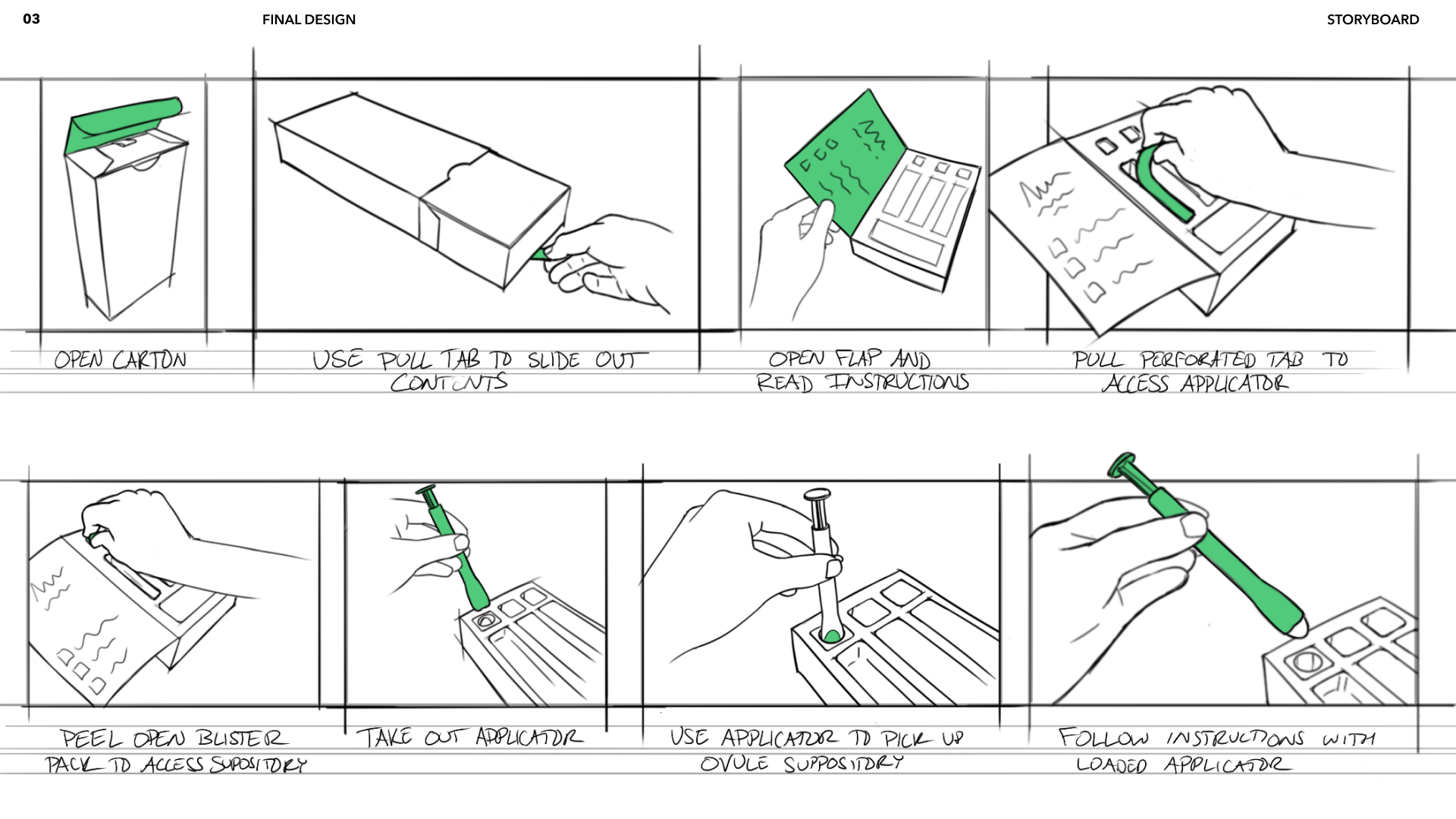
The final product design allows for each component of the internal packaging to be presented to the user in the series of steps that they would take to use the treatment. Additionally, this means that each component can be stored neatly without risking losing any pieces or the sanitation of the product.
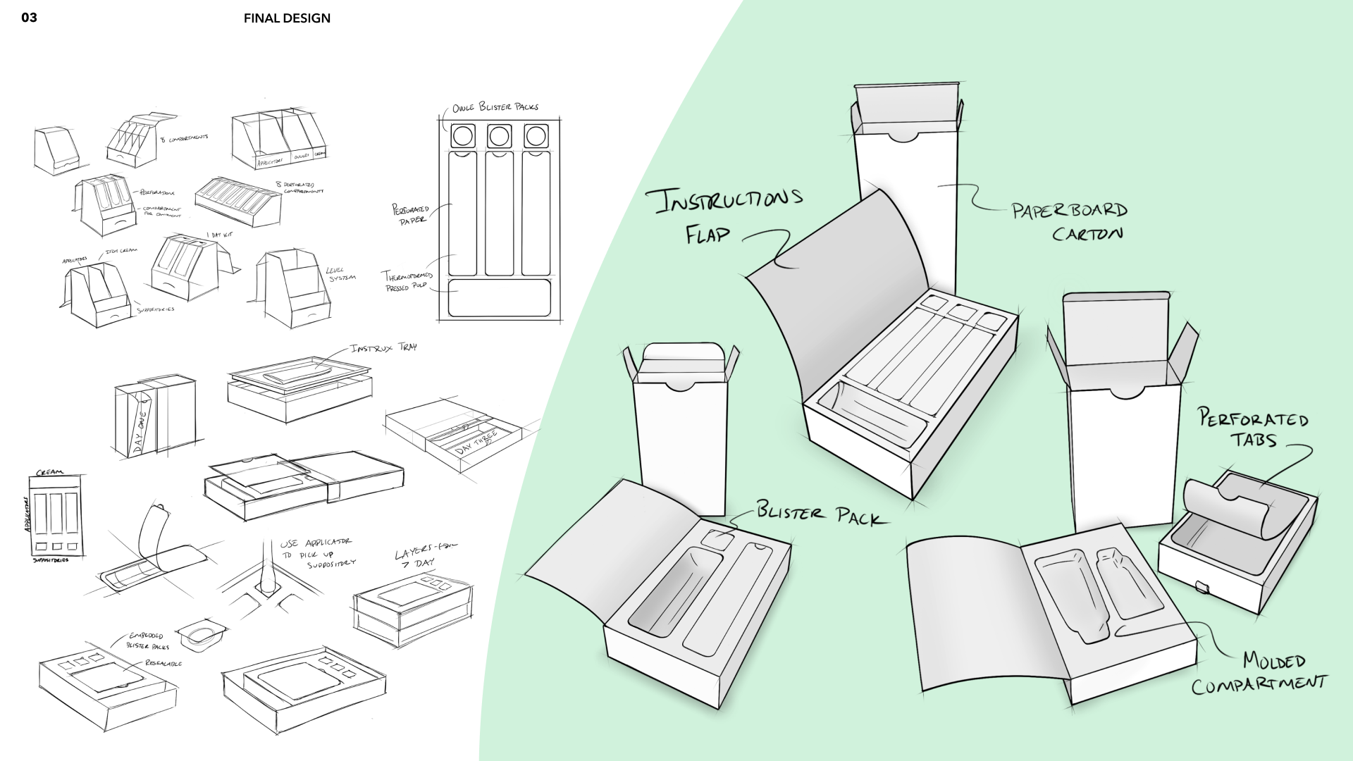
Final Form Design
Our team felt that the current user experience of the applicator itself did not align with Candid’s goals for the next generation of this product.
The applicator was redesigned to be easier to grip. The applicator can now also be used as the tool to pick up the ovule instead of handling it with your fingers. The applicators also now feature a color system that gets lighter over days used to signal the fading infection.
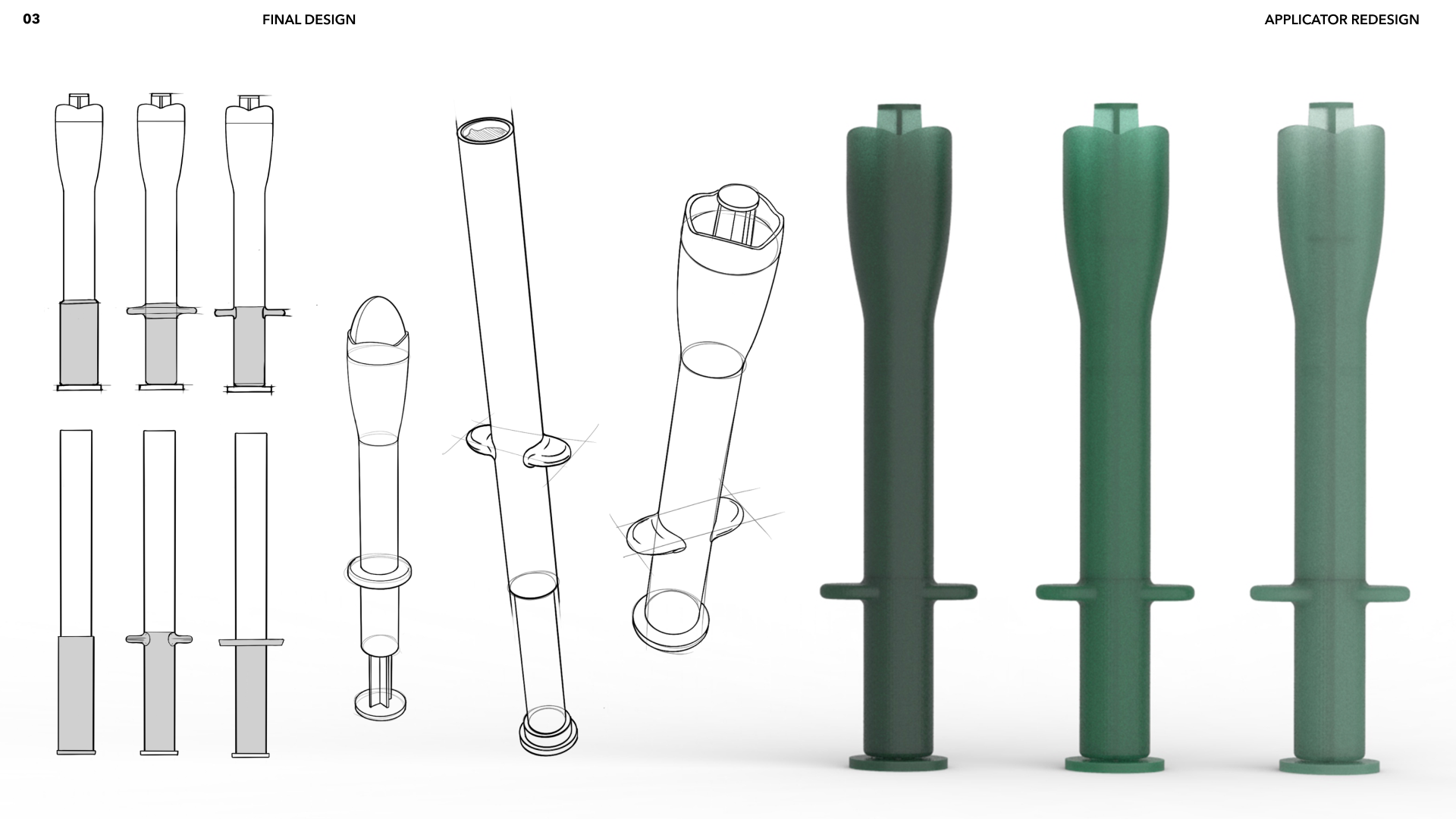
Applicator Redesign
Our team wanted to use sustainable materials and aligned with professionals in the packaging industry to speak more in-depth
about the recyclability of specific materials.
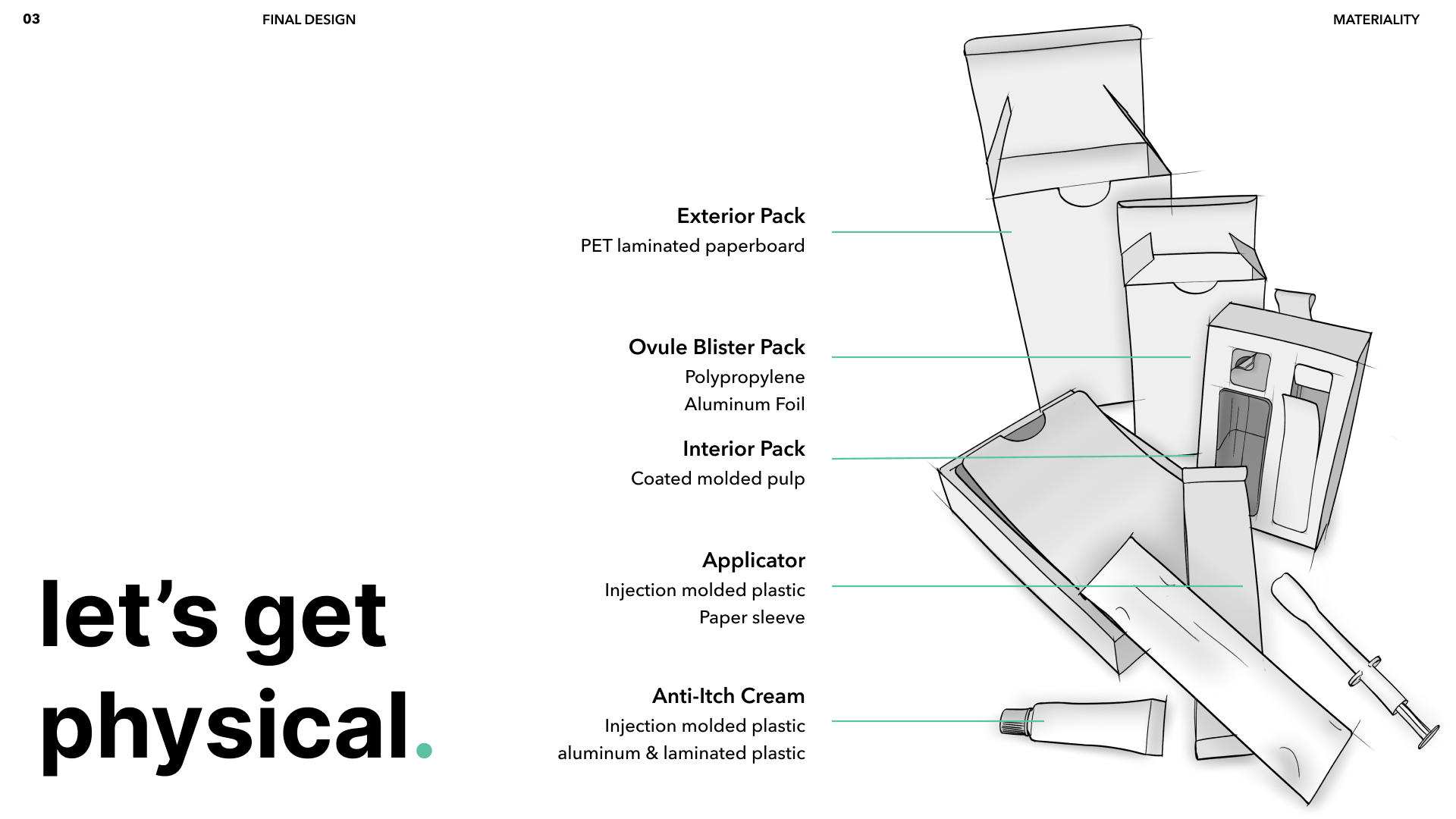
Materiality of Pack
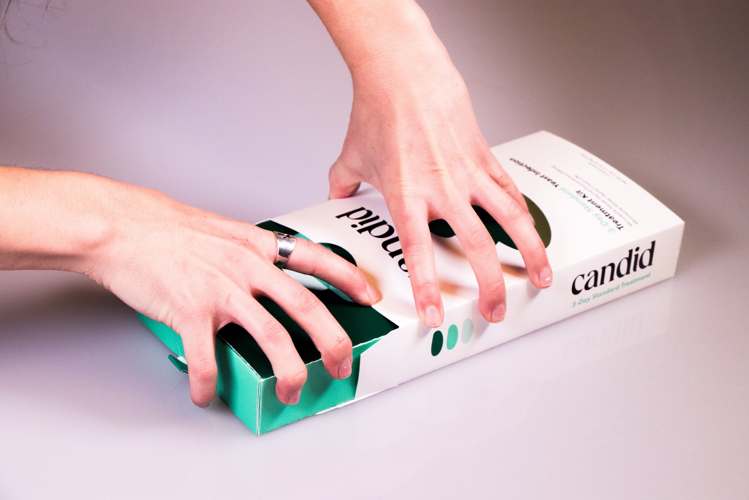
Production and the application of graphics on the physical pack.
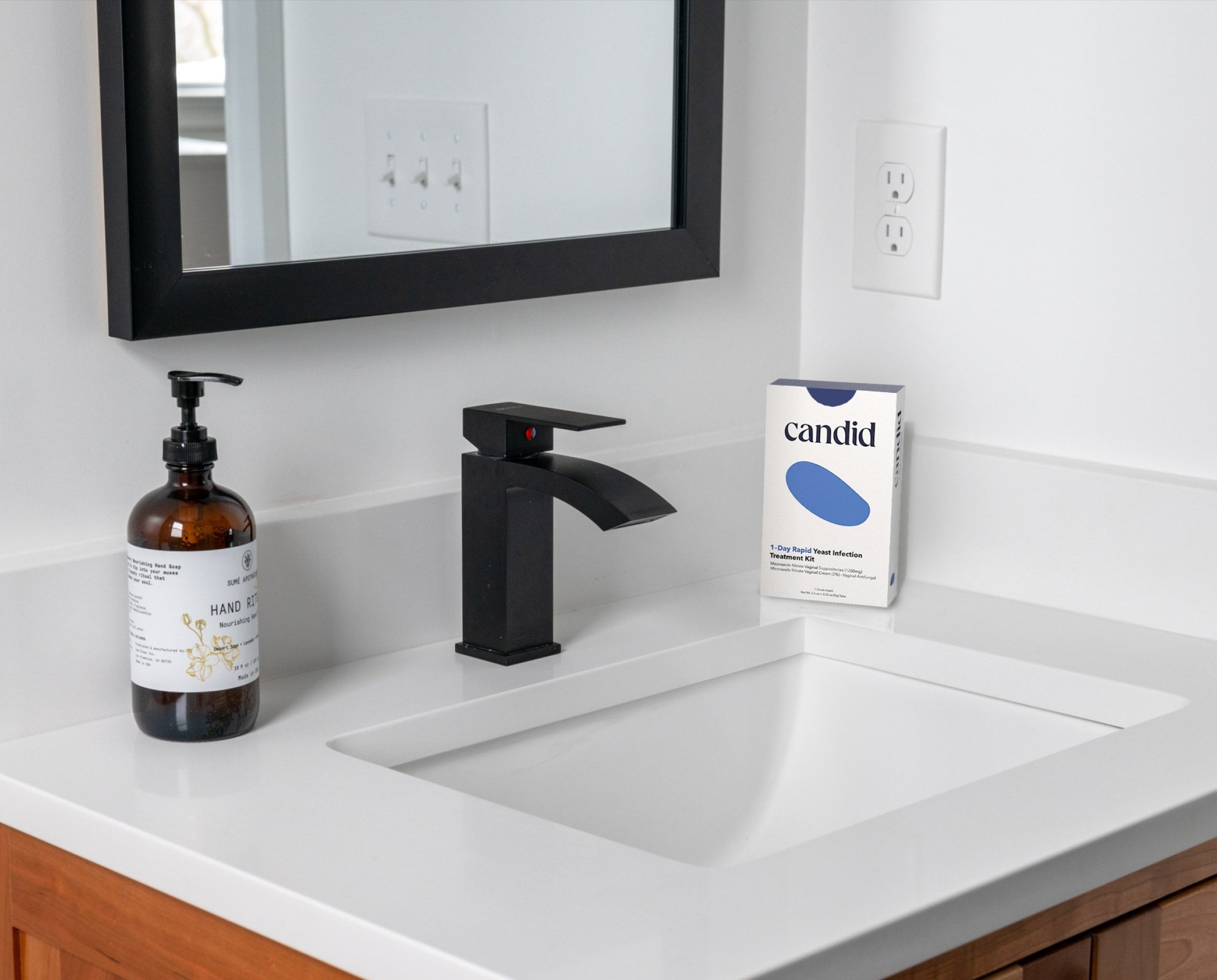
Final Packaging