Logo Identity Redesign
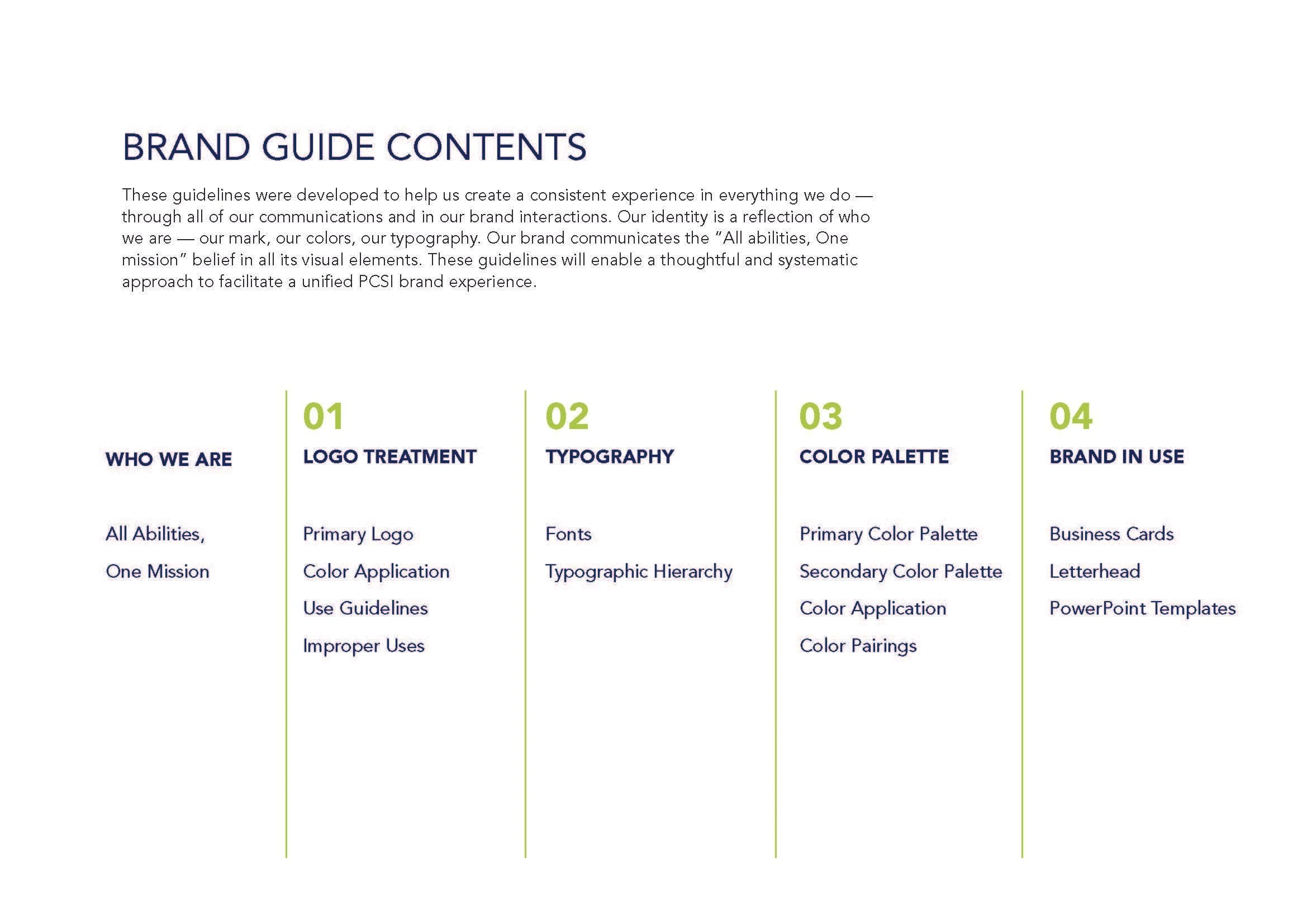
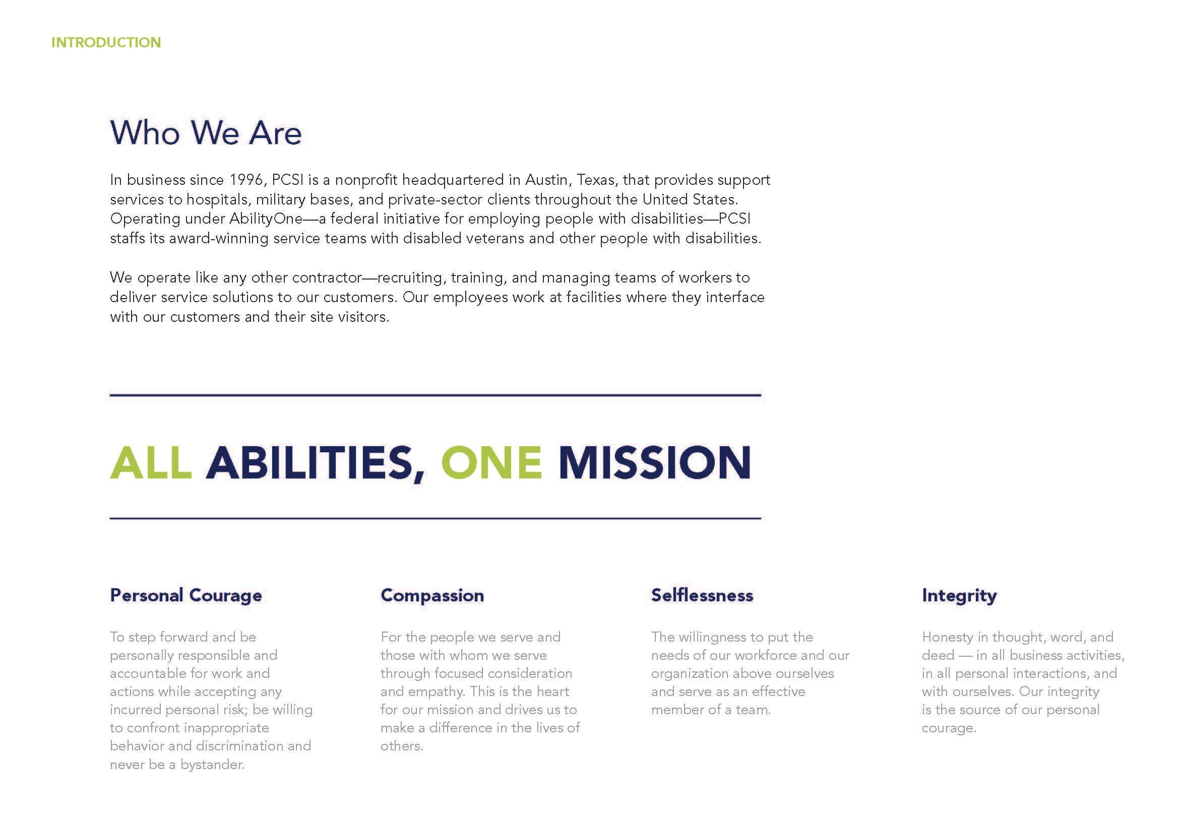
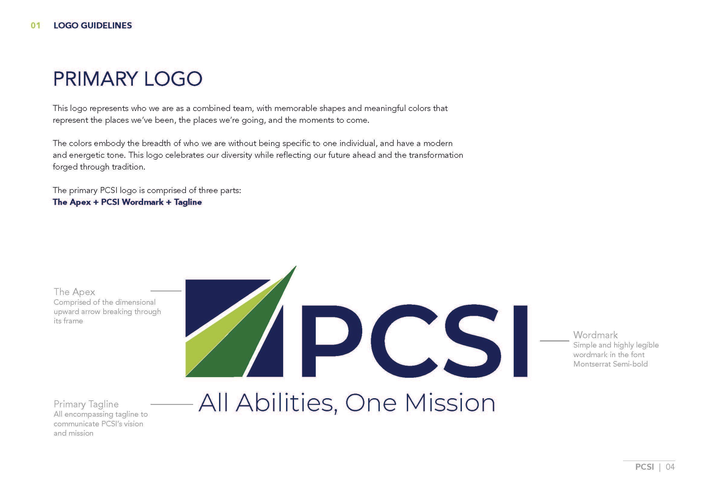
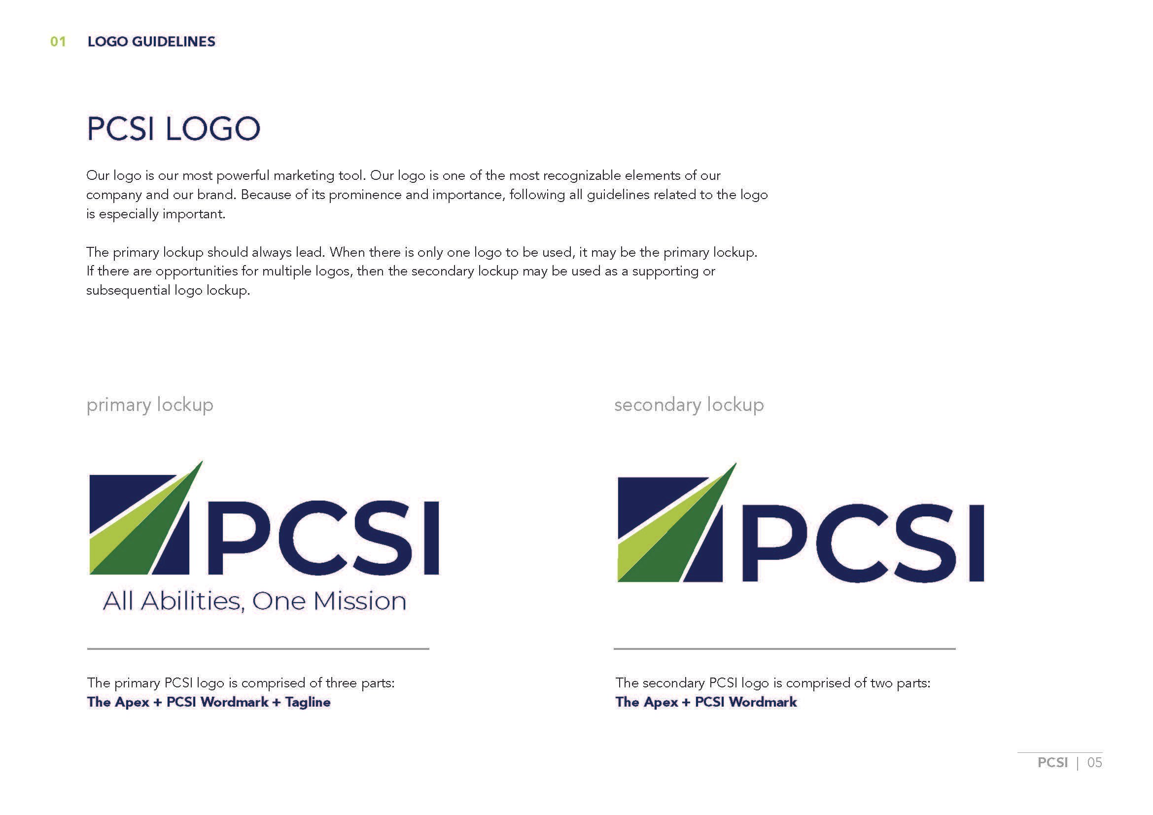
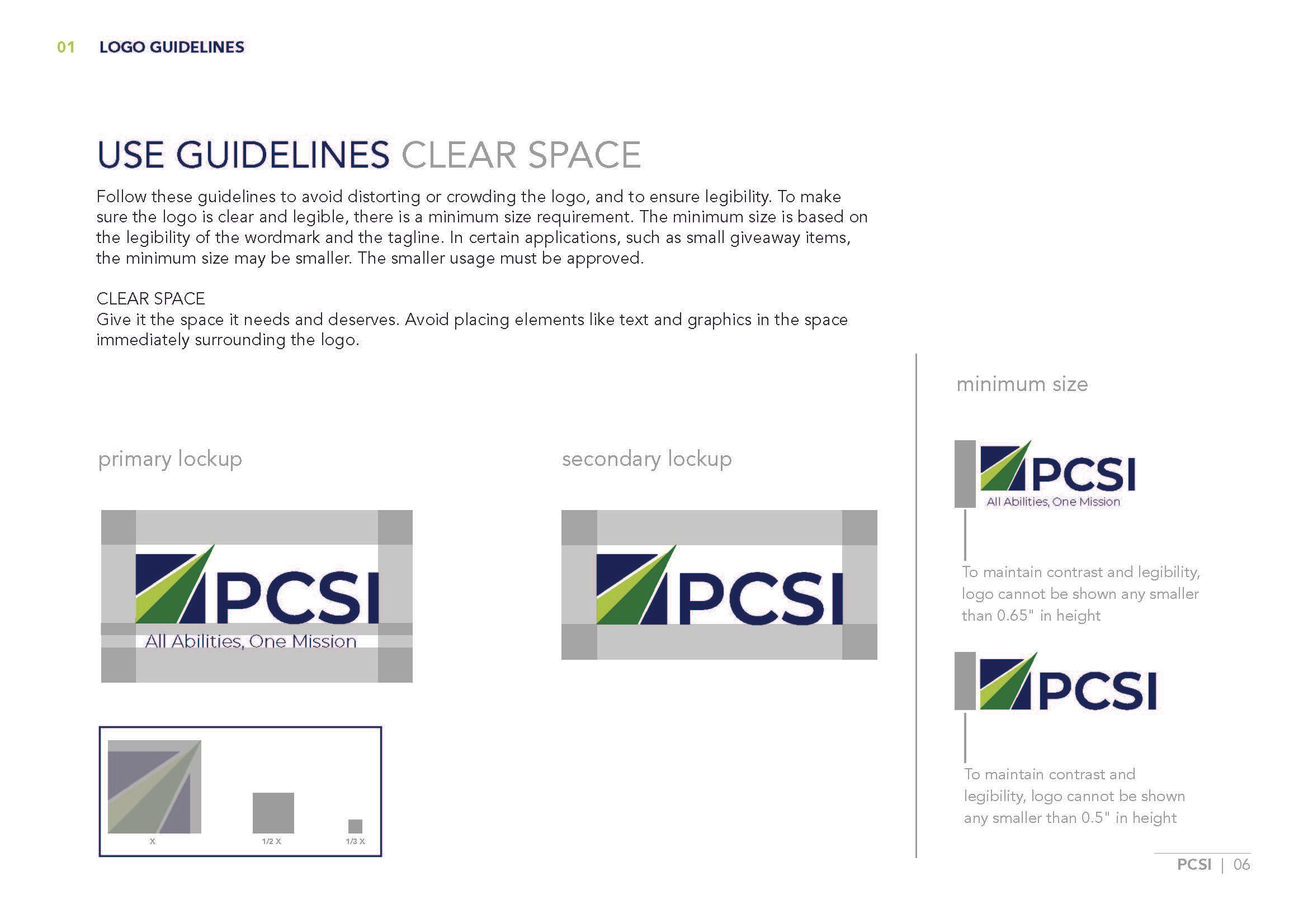
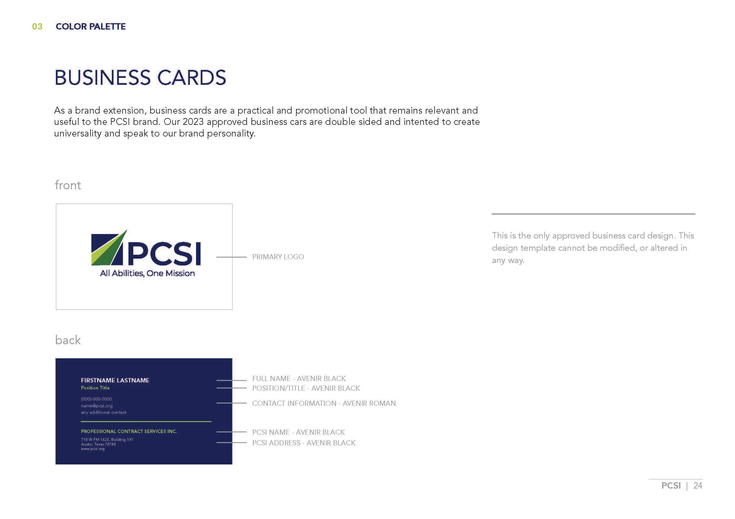
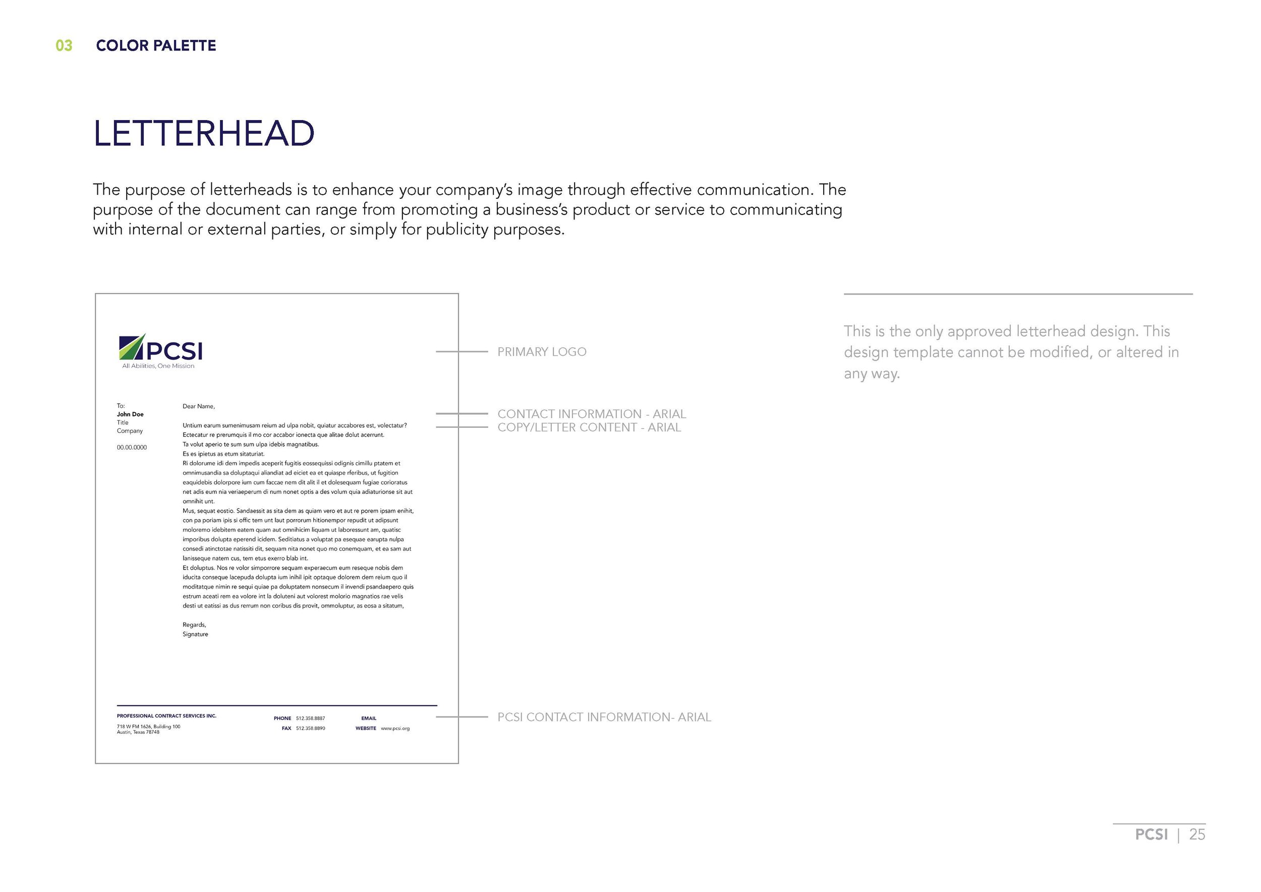
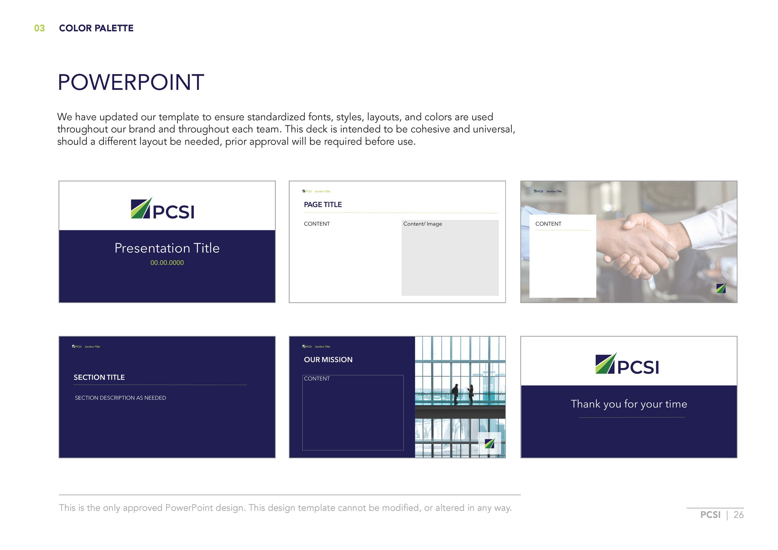
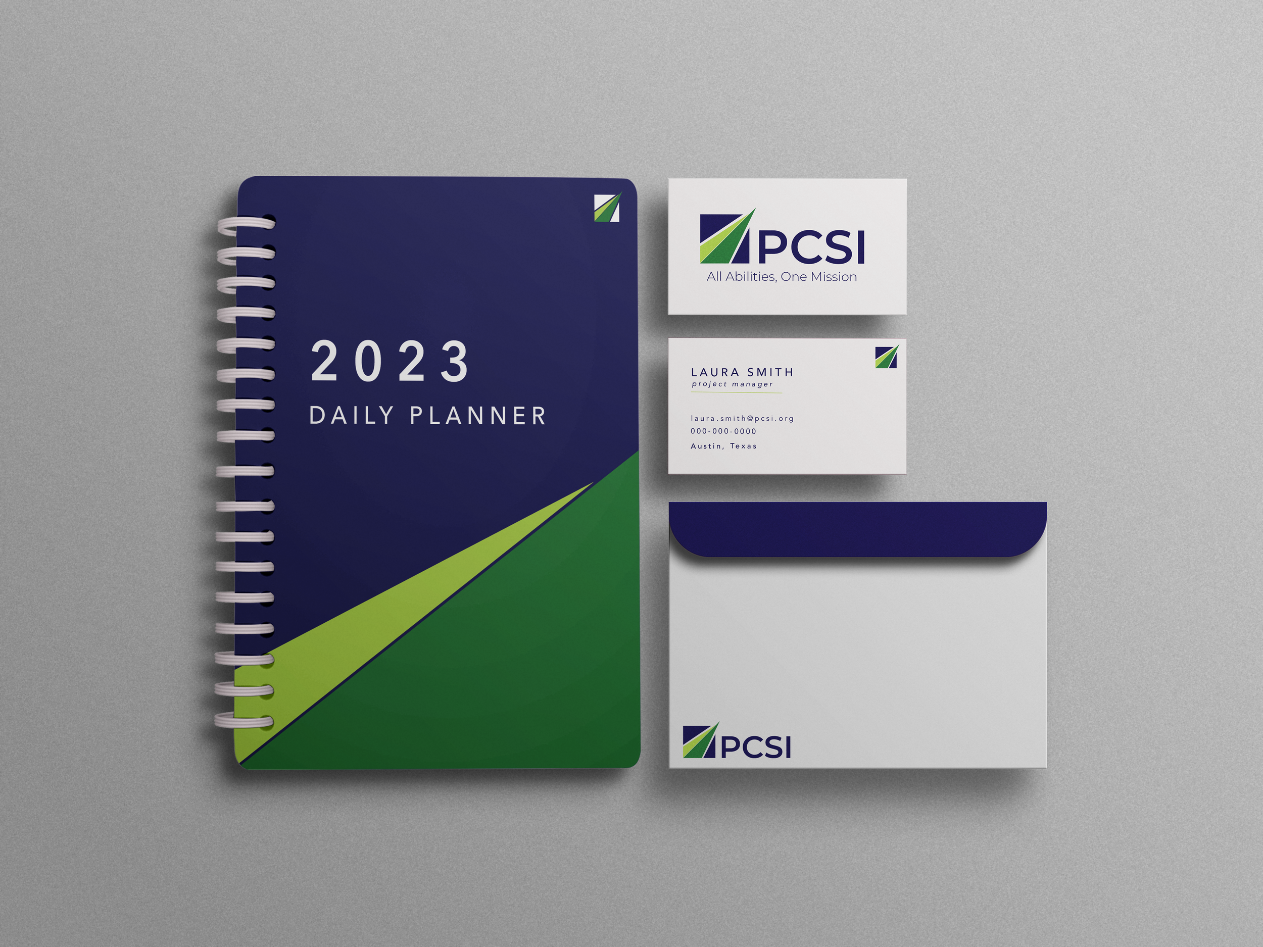
Logo redesign project for PCSI, an employment contracting service that specializes in employing veterans and people with physical and developmental disabilities. The logo redesign also extended into creating a brand guidelines package as well as the design of stationary for the brand.
OBJECTIVES
Create a flexible design that meets a variety of visual uses
Honor existing brand and brand history
Create a logo that will reflect company values
Create brand guidelines for new logo
Manage client interactions
TOOLS
Photoshop
Adobe Illustrator

Heart & Compassion
Heart & Compassion relates to PCSI’s core value of uplifting and supporting their employees. The heart features two interlocking sides which alludes to PCSI’s wide client range.
Empower & Champion
Empower & Champion is designed as a badge of honor which would symbolize the confidence and empowerment that PCSI hopes to instill in both their employees and partners.


Breaking Barriers
Breaking barriers is meant to symbolize the way in which PCSI reimagines and redefines the workplace. PCSI aims to bring people together within their organization and community.
Shown above are the initial conceptual directions defined. As design strategy continued to develop, concepts combined and shifted to create new various categories. Each category still focused on CONNECTION, EMPOWERMENT, & BREAKING BARRIERS
PRELIMINARY DEVELOPMENT
Key Word and Image studies conducted with the client to outline conceptual direction and preferences.
Conceptual Directions

The client wanted to include an option that felt humanistic. For heart & compassion, hands were used as a symbol of the people who make PCSI function day to day. The intersecting heart icon is meant to symbolize the diverse body of employees coming together under PCSI, as well as the intersection of many different industry lines that PCSI works within.
02. CONNECTION
Refining the connection of the heart to create a more concise and cohesive shape
Shape of the hands become more softened, and the space between the hands decreases to better frame and uplift the heart
Concerns about showing stereotypical imagery relating to people with disabilities shifted the conceptual direction of Empowerment. The client wanted to see an option that would combine the humanistic approach of Empowerment, with the symbolism shown in Breaking Barriers to create a sort of badge. By using the initial heart shown in Empowerment, excluding the hands, I refined points of negative space to better reflect the geometry of Breaking Barriers.

Used the geometry of both symbols of Empowerment & Breaking Barriers to create an all encompassing symbol of Connection.
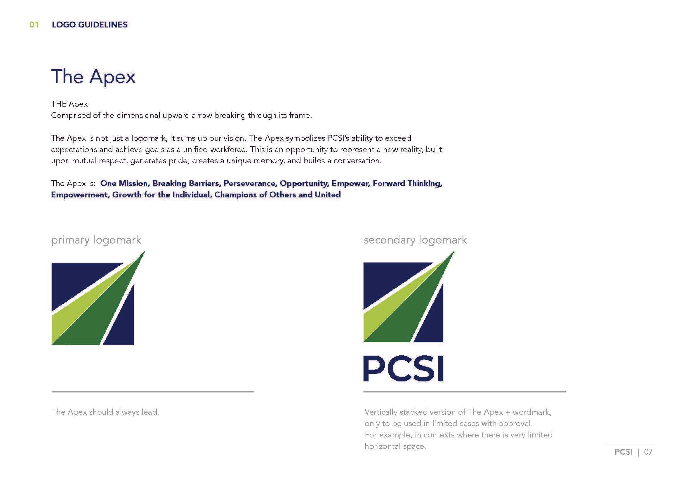
To avoid any imagery of physical human attributes, and to avoid any sort of stereotypical imagery that felt medical, One Mission is an icon developed that represents the trajectory of PCSI and their employees, as well as an abstract representation of the goal and vision of PCSI. The One Mission symbol shows the dynamic movement of multiple points to a single point which alludes to growth. Additionally, the “shooting star” breaks its framed box which further symbolizes PCSI’s core mission of breaking barriers and exceeding expectations.

Mark of Empowerment

Mark of Connection

One Mission, One PCSI
DESIGN DEVELOPMENT
01. EMPOWERMENT
ONE MISSION
Summary of Concepts

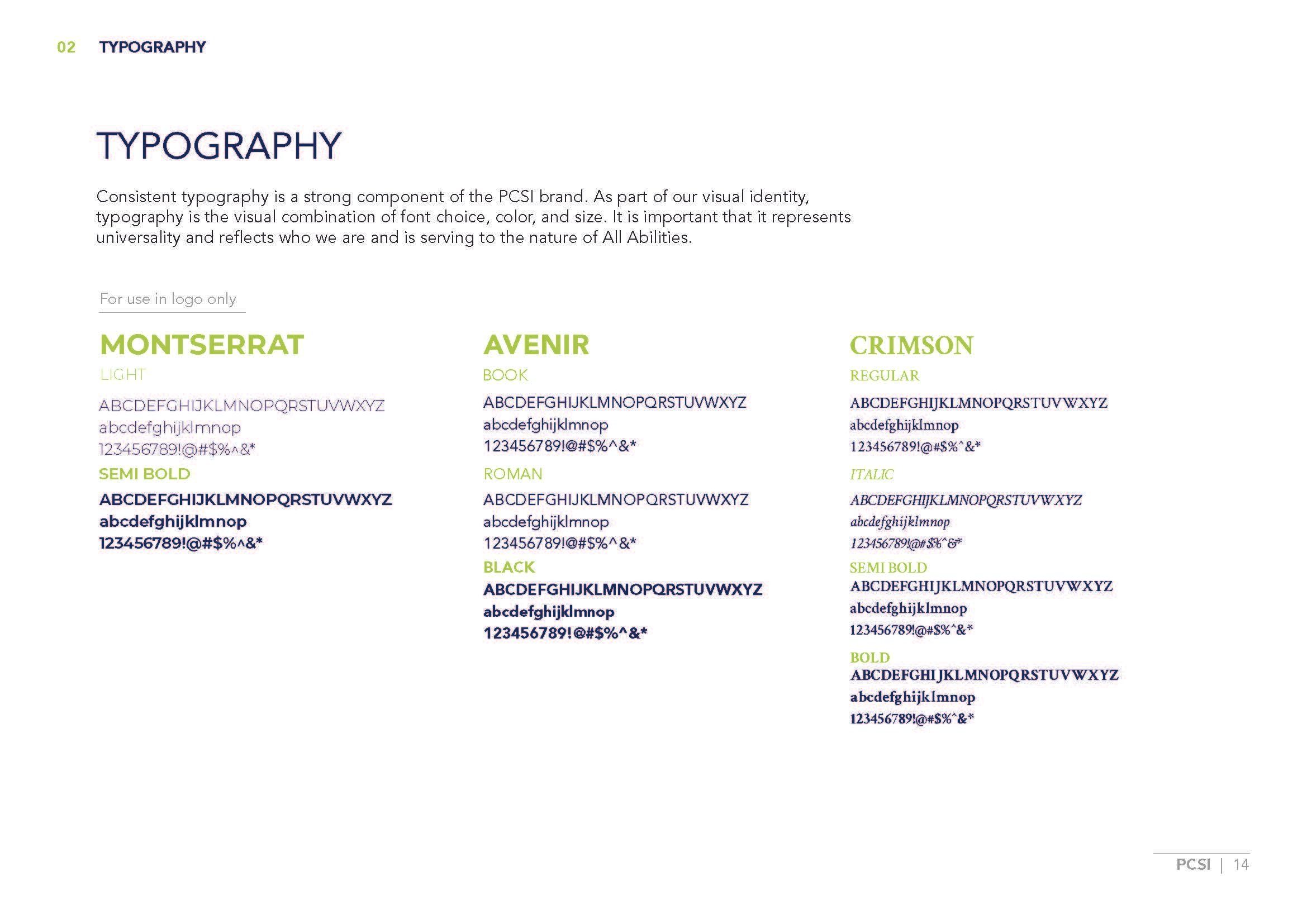
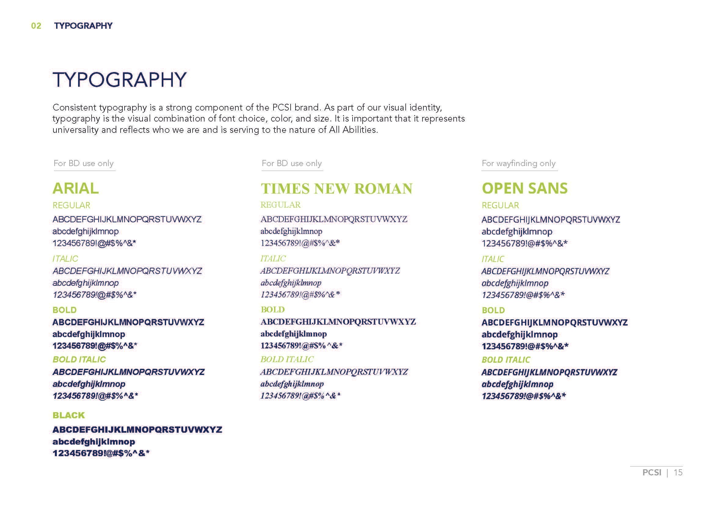
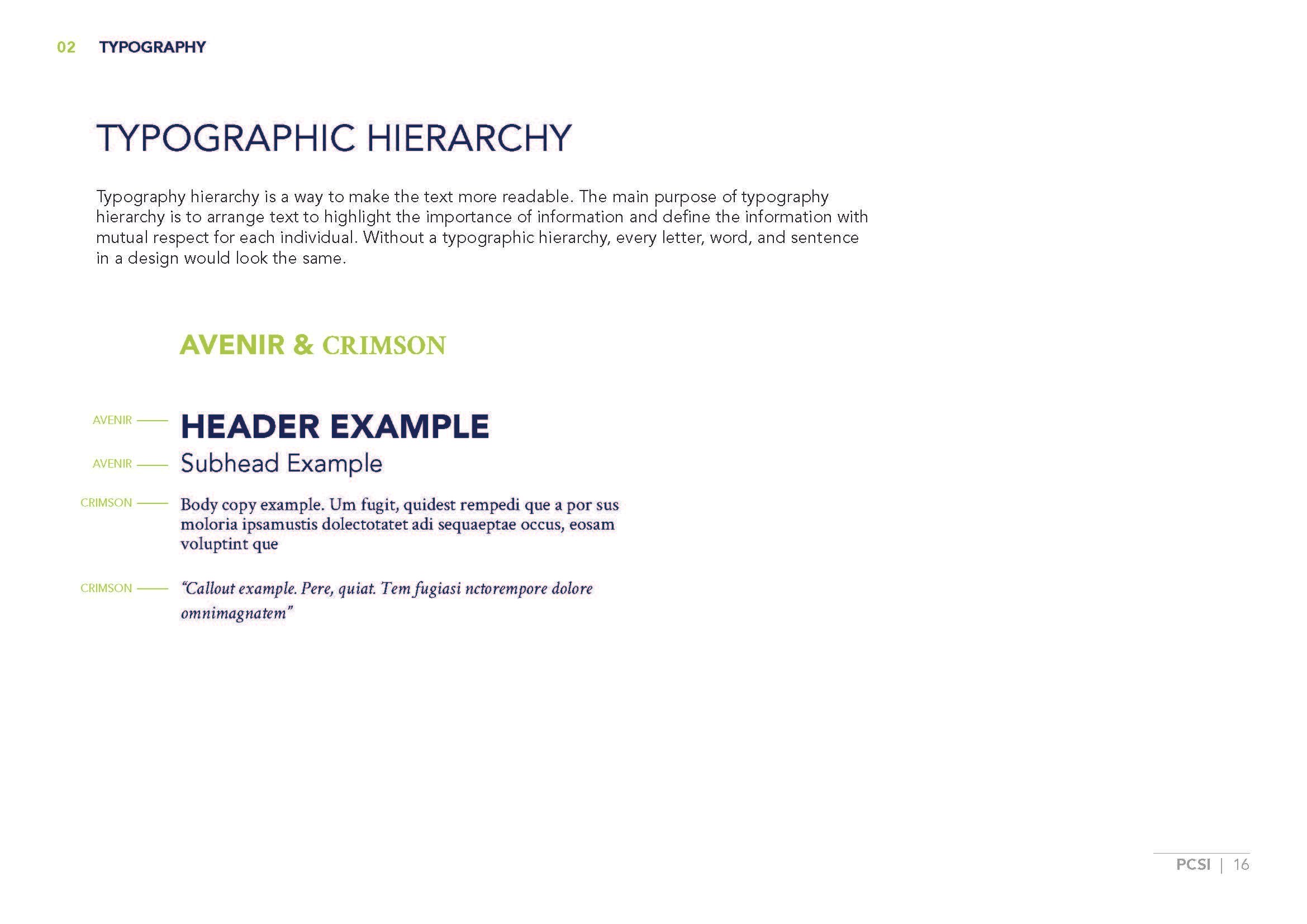
Updated typeface requested by client
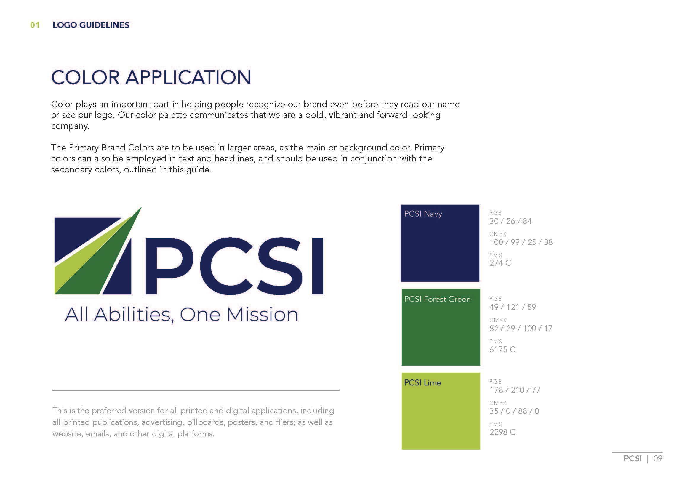
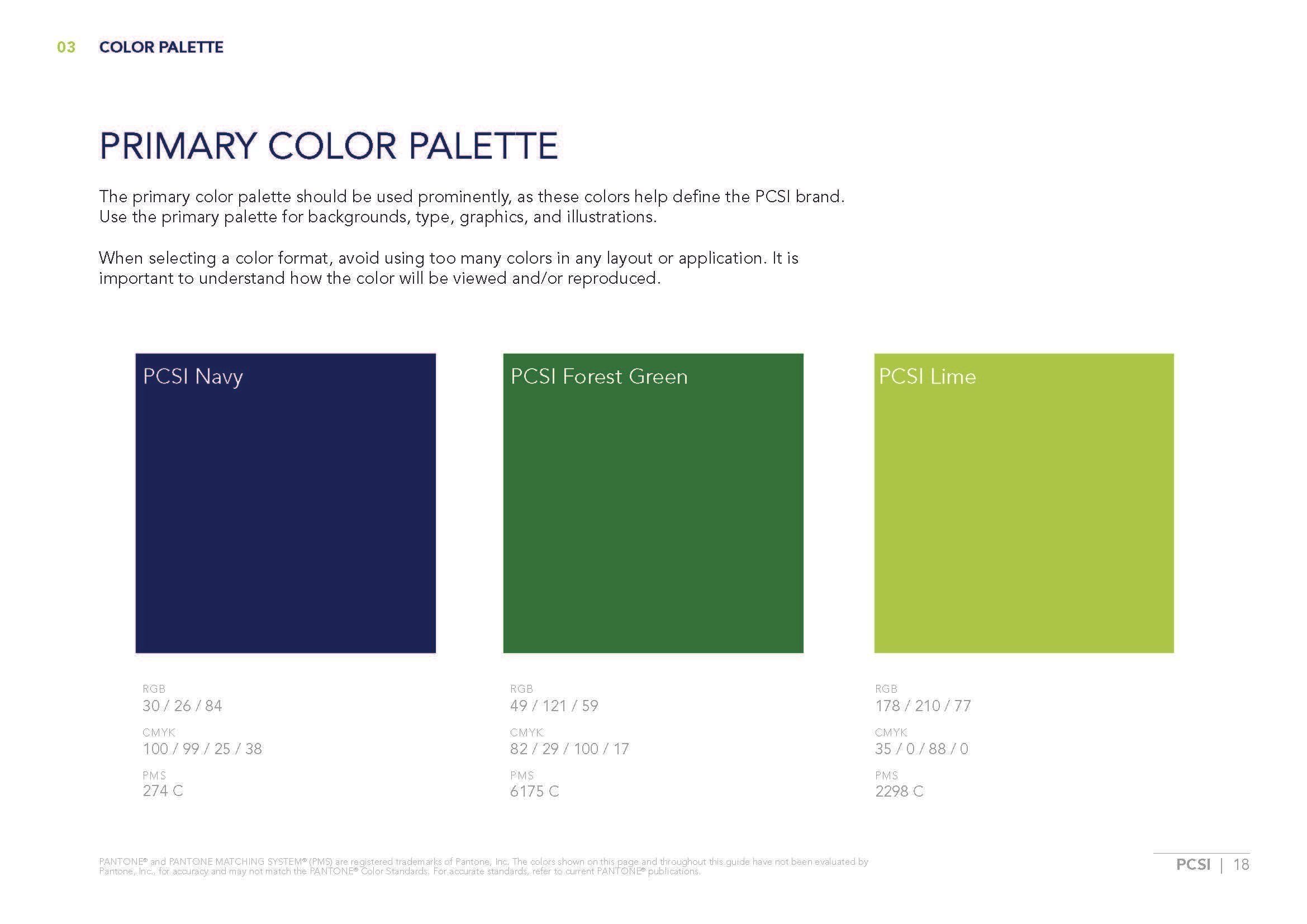
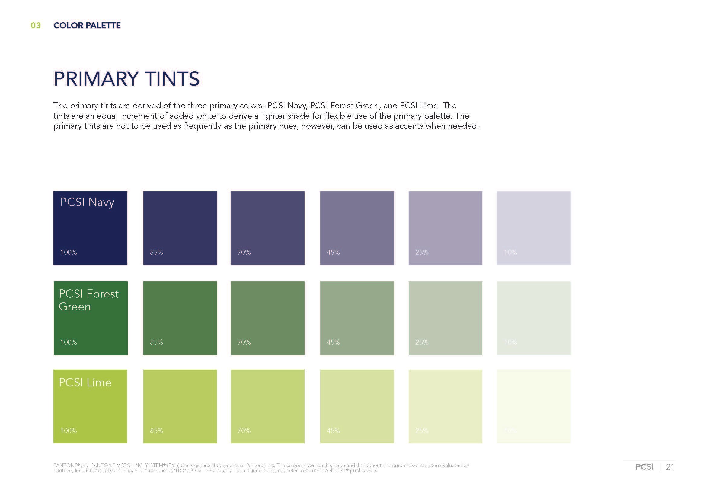
Updated forest green color to call back to the original PCSI green
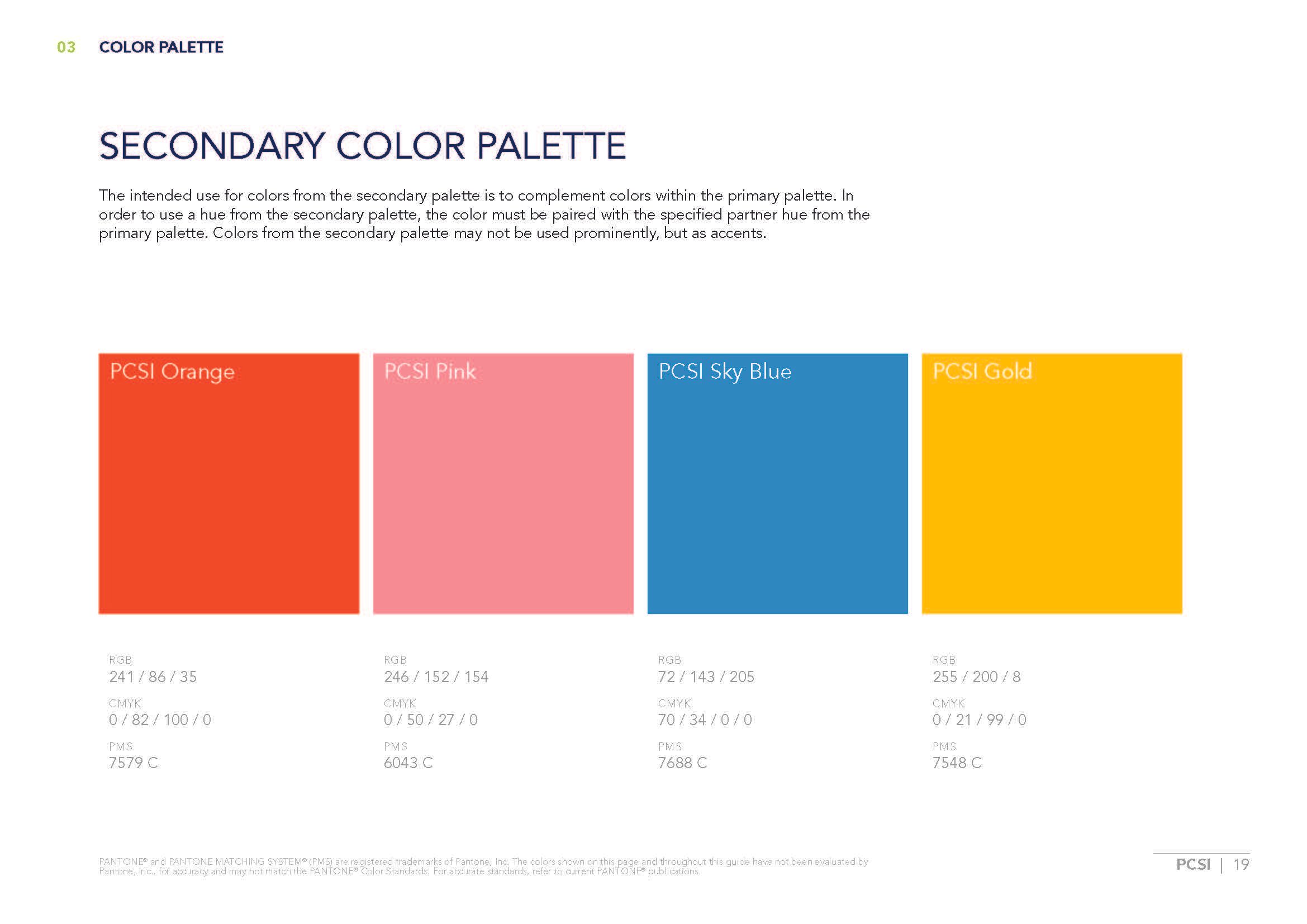
Client requested color palette be adapted to emphasize brighter colors, & include a shade of green similar to OG PCSI green


DESIGN REVISION
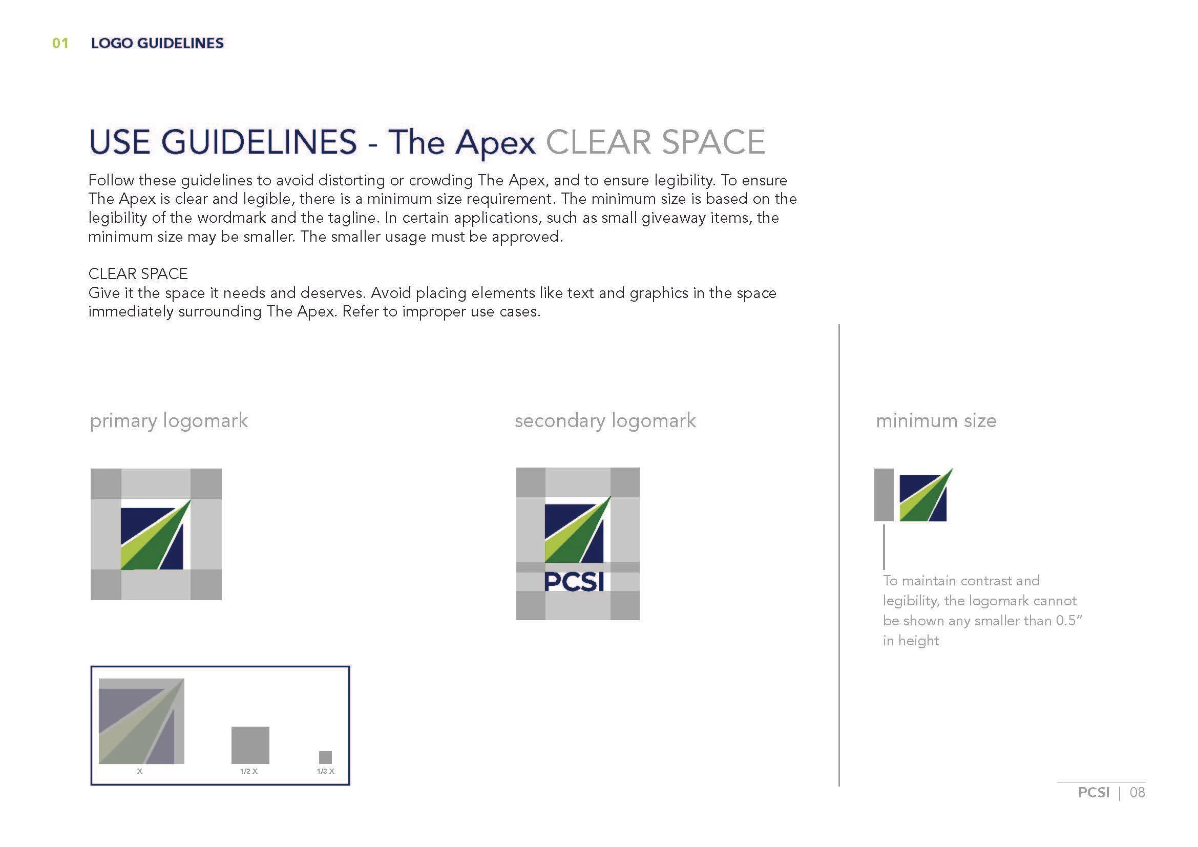
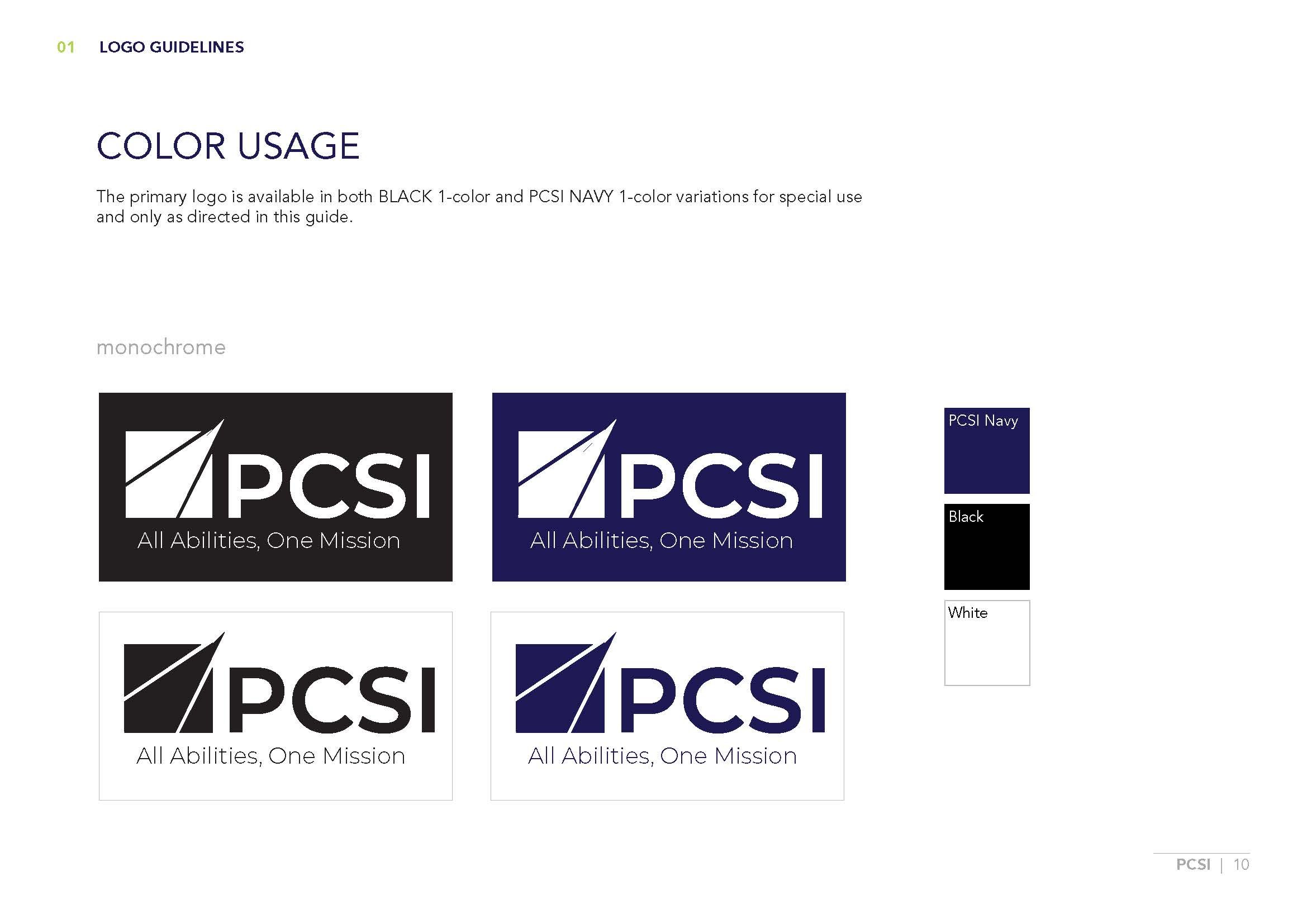
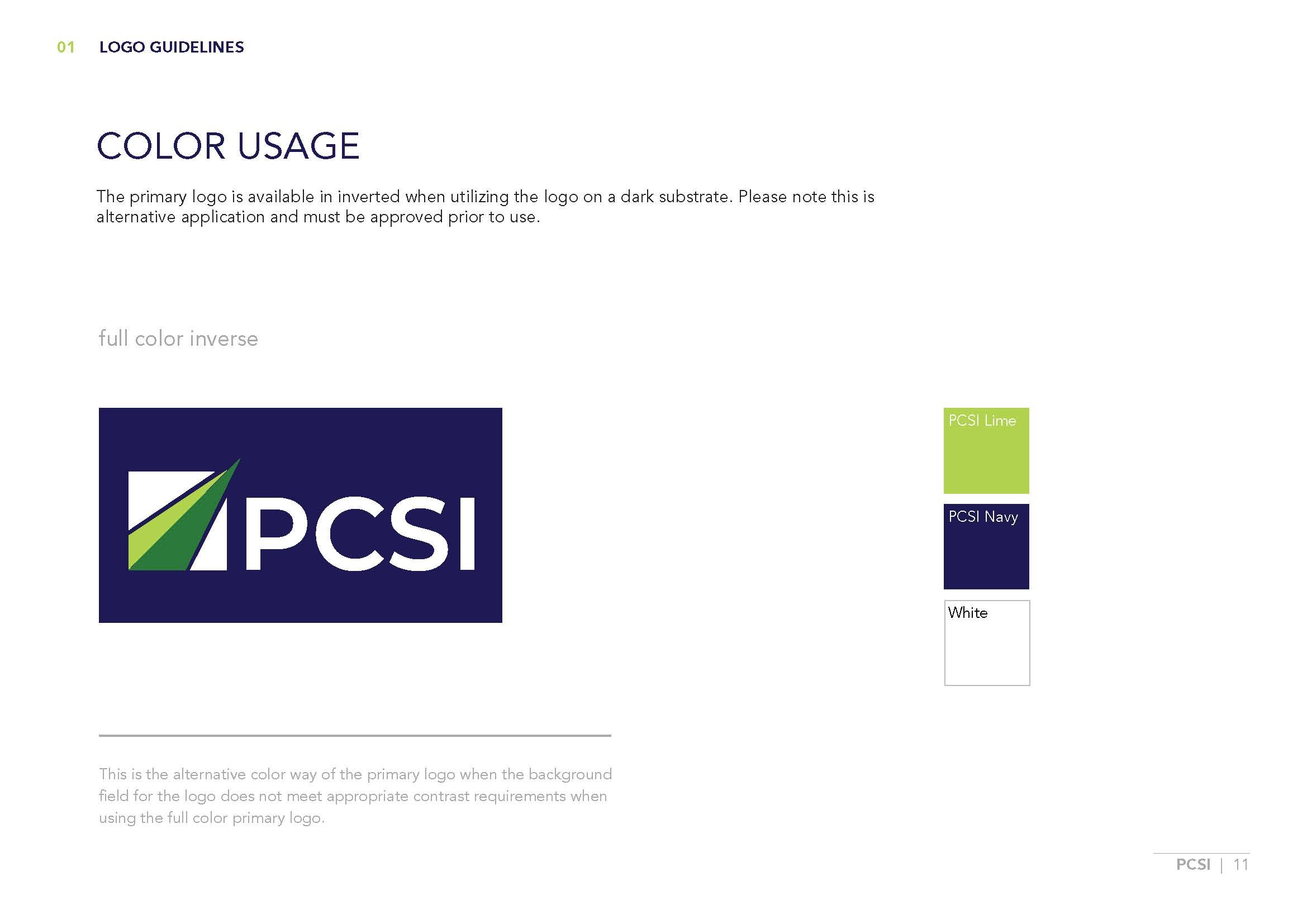
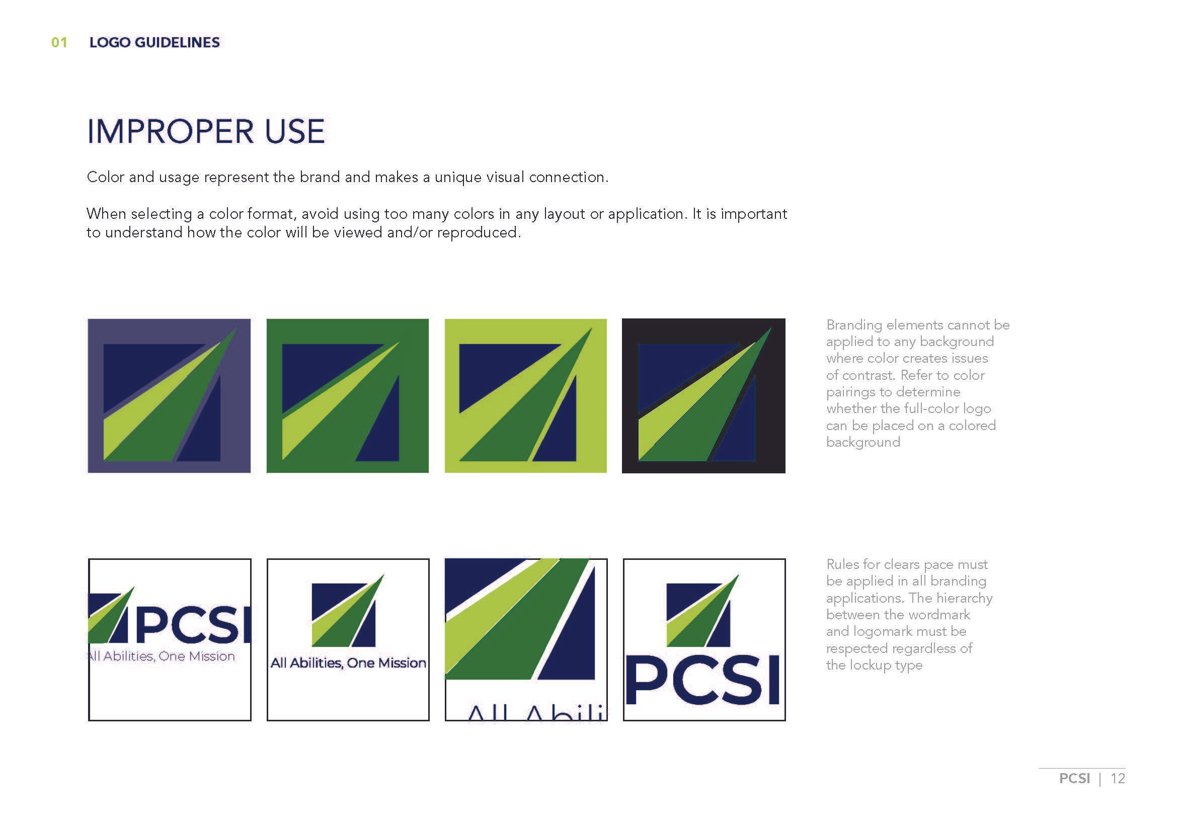
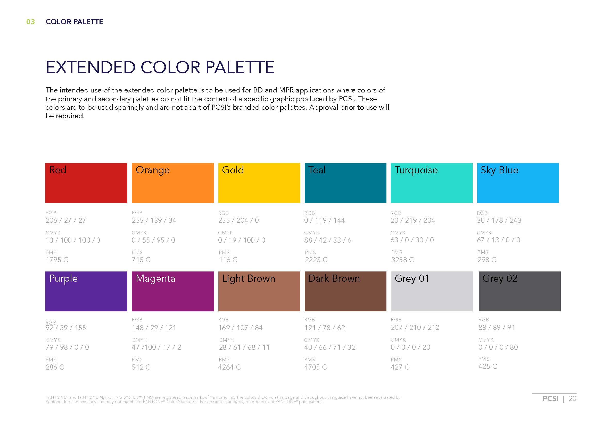
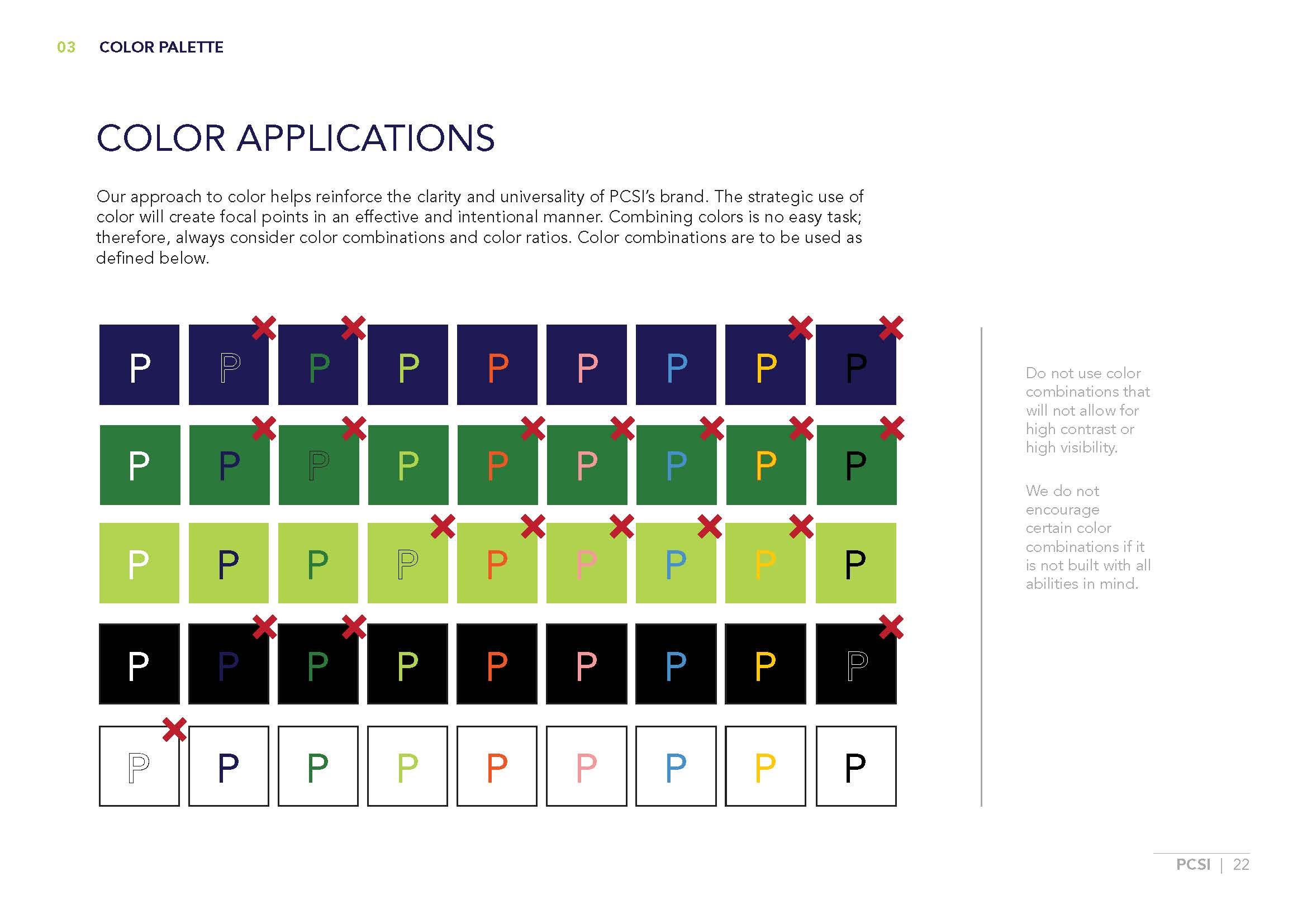
BRAND GUIDELINES
